Suvera
A virtual clinic for proactive care
Context
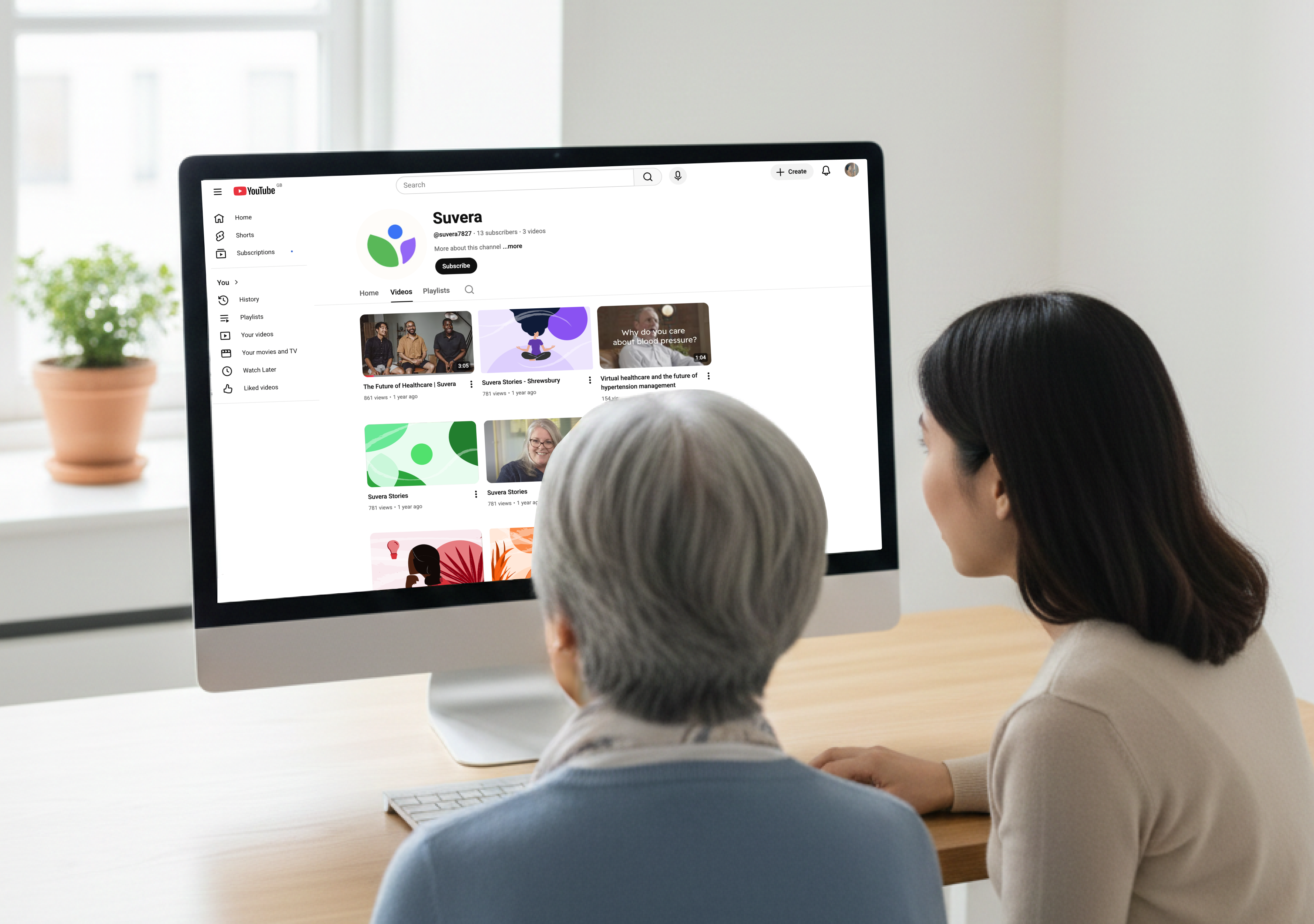
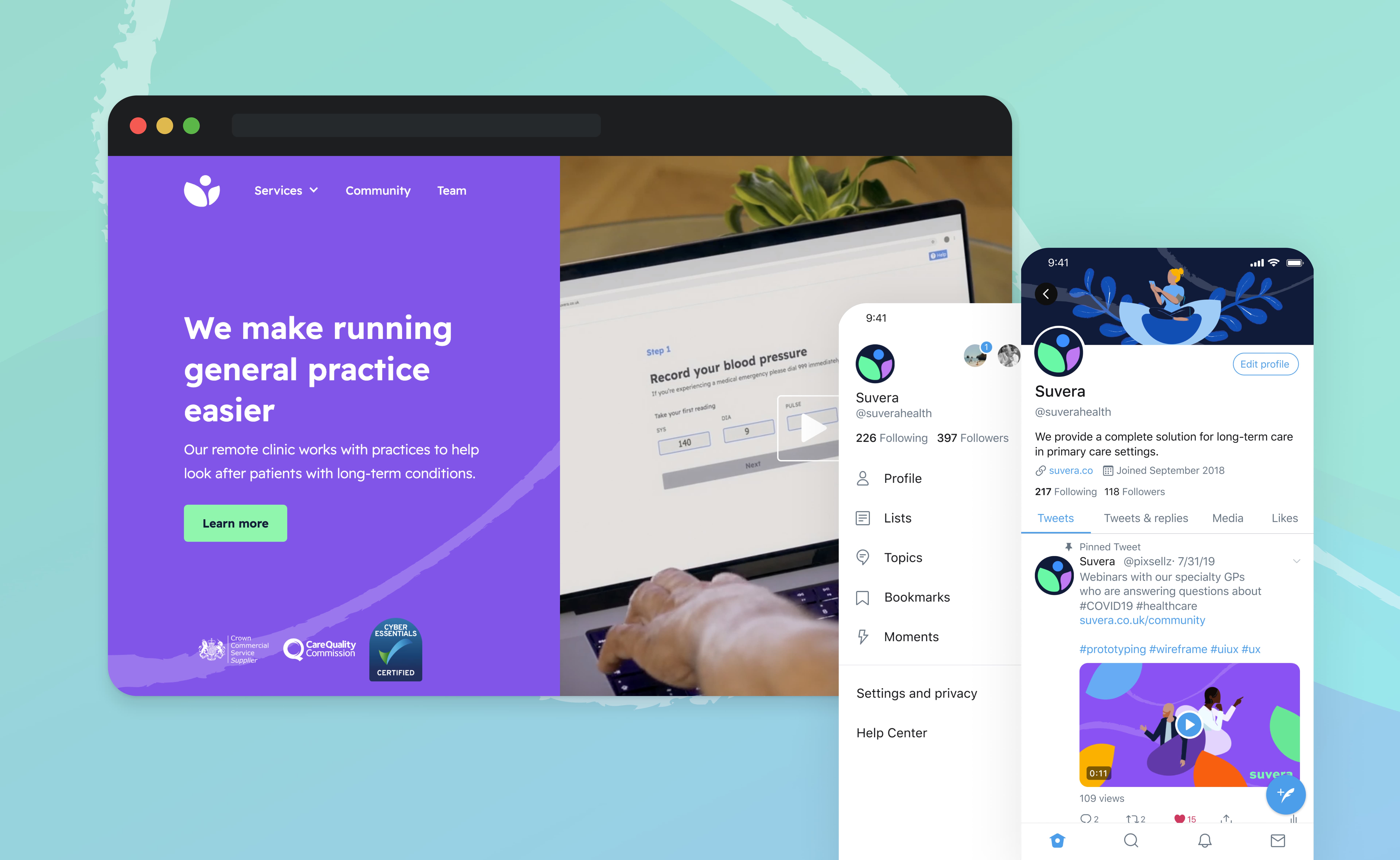
Suvera is a remote clinic that partners with NHS practices to deliver proactive care for patients with long-term conditions. When I joined the project, the team had been frustrated with their existing logo for some time. The brand had accumulated assets across different communications without a unifying system behind them. They needed something that could take them into their next stage of growth coherent, scalable, and distinctly not what NHS branding usually looks like.
Problem
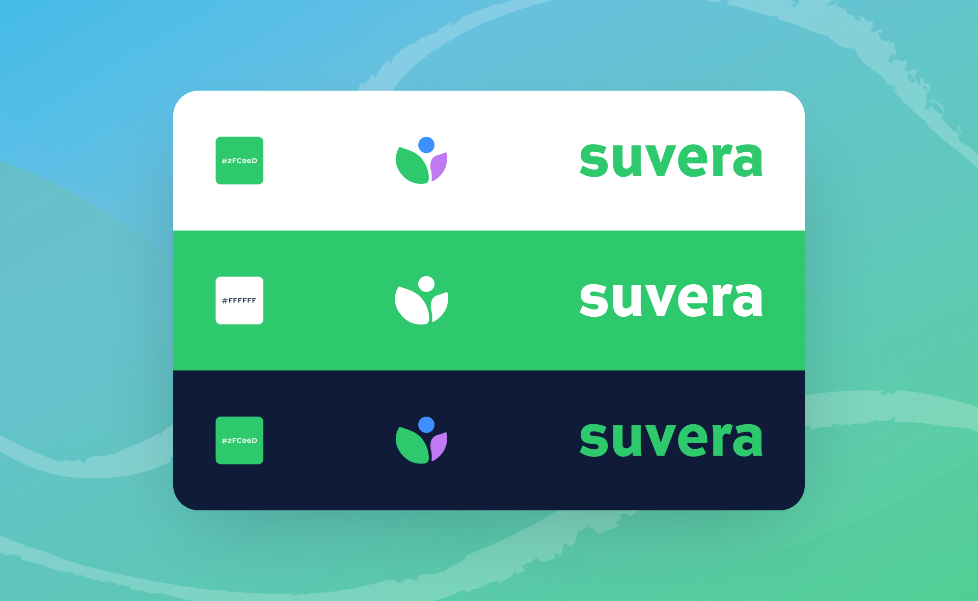
The brief had a specific constraint baked in: retain a variation of the existing S from the current logo. The team had equity in it. The work wasn't a blank slate, it was a rebuild that had to honour what came before while leaving it behind.
The wider problem was identity. Suvera operates at the intersection of technology and care, working alongside GP practices rather than replacing them. The brand needed to communicate that position clearly, a new kind of entity, not another NHS grey, and not a generic health tech startup.
Goal
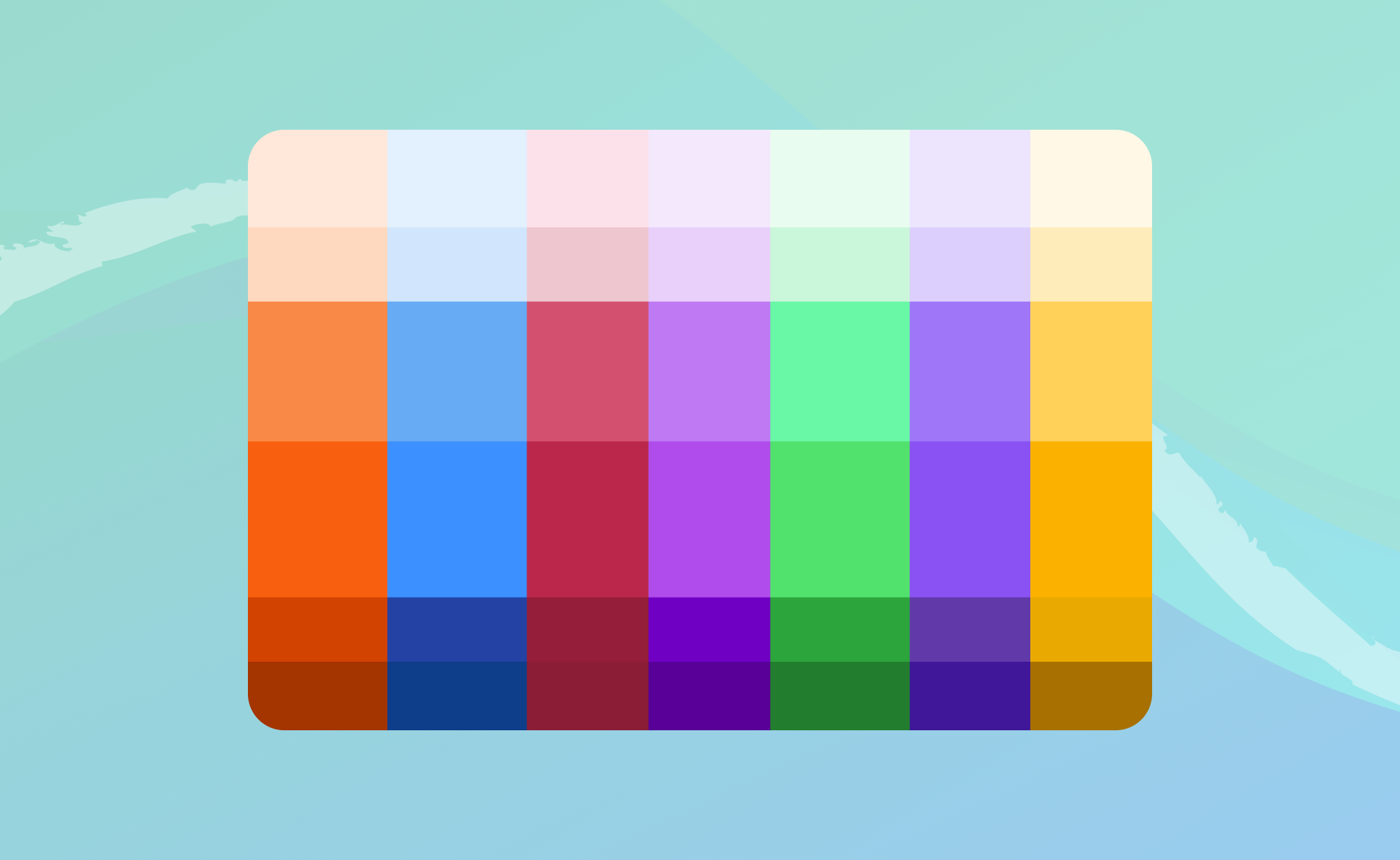
Design a brand system that could travel far beyond a logo, across patient communications, clinical dashboards, blog content, physical materials, and illustrations. The colour palette in particular needed enough range to sustain an entire content ecosystem, not just a website header.
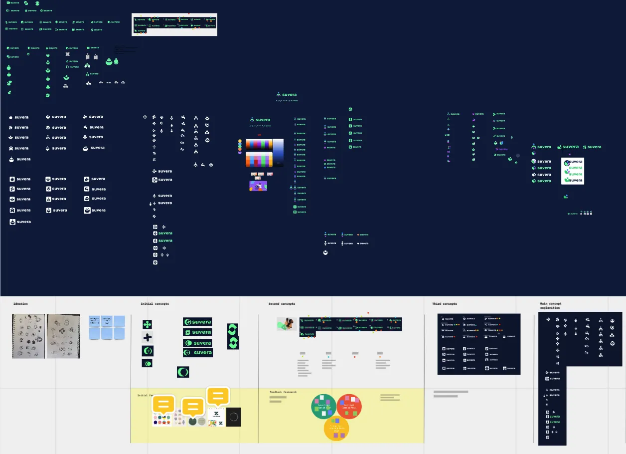
Finding the concept through three directions
The process started with a mind map drawn from the meaning of Suvera itself, which produced three distinct directions to explore: Parts of a Whole, Suvera as a conduit between doctors, patients, and the wider system. Giving, the transfer of time, care, and attention that the product enables. Dawn, a new beginning for long-term condition management, instilling hope.
Dawn had the strongest USP alignment, it captured the shift from reactive to proactive care that sits at the heart of what Suvera does. But the final logo didn't abandon the other two directions. The green and purple leaves carry Parts of a Whole, the open form carries Giving, and the rising blue circle carries Dawn. All three concepts ended up in the mark, which is unusual, and only worked because the iteration process was rigorous enough to find the overlap.
Building a colour system that could do everything
A deliberate decision was made early to build a wide-ranging colour palette not a standard primary/secondary system, but a full spectrum that could sustain illustrations, blog graphics, physical materials, and patient communications simultaneously. Healthcare brands typically constrain themselves to two or three colours in the name of professionalism. This one needed enough range to feel genuinely warm and human across every touchpoint. The palette was built on a scale from dark to light specifically to ensure contrast accessibility was embedded in the system, not bolted on afterwards.
Iterating in stages, not in secret
Rather than presenting one final logo at the end, the process involved staged iterations with team voting at each round. The risk with that approach is design by committee, decisions made to please rather than to solve. The safeguard was maintaining a clear concept thread across every iteration, so the team were always voting between versions of the same answer rather than between different answers entirely.
Strategic considerations
The long timeline was a genuine gift on this project, it allowed the concept exploration to be thorough rather than pressured. Most brand projects are compressed, which forces designers toward safe solutions. Having space to explore all three directions properly before converging was the reason the final logo could carry all three without feeling confused.
The colour palette decision was the one I felt most strongly about and would defend most readily. Healthcare brands underestimate how much the visual temperature of a system affects whether patients feel the organisation is for them. A narrow, clinical palette says 'institution'. A warm, generous palette says 'this is different'. That distinction is the entire Suvera positioning made visual.
What I'd do differently
The brand has changed significantly since I handed it over, which is normal, brands evolve with the organisations they belong to. But looking at where it's gone, I'd have built more explicit guidance into the system for how the palette and graphic elements should evolve over time. A brand system without evolution guidelines is a brand system that diverges. I'd make that documentation a non-negotiable deliverable rather than a nice-to-have.