B AGRO
A modern identity for a generational coffee legacy
Context
BAGRO is an Ethiopian coffee producer and exporter with a generational legacy of Arabica cultivation. The farming operations were well established. The brand wasn't. When I joined the project they had no cohesive visual identity to represent them internationally, they needed something that could sit alongside global coffee brands and hold its own.
The problem
The challenge was balance. The brand needed to feel credible and modern enough for international buyers and trade partners, while remaining genuinely connected to the agricultural communities and landscapes it came from. A brand that leaned too far toward heritage would feel folksy. Too far toward contemporary and it would feel like it could be from anywhere.
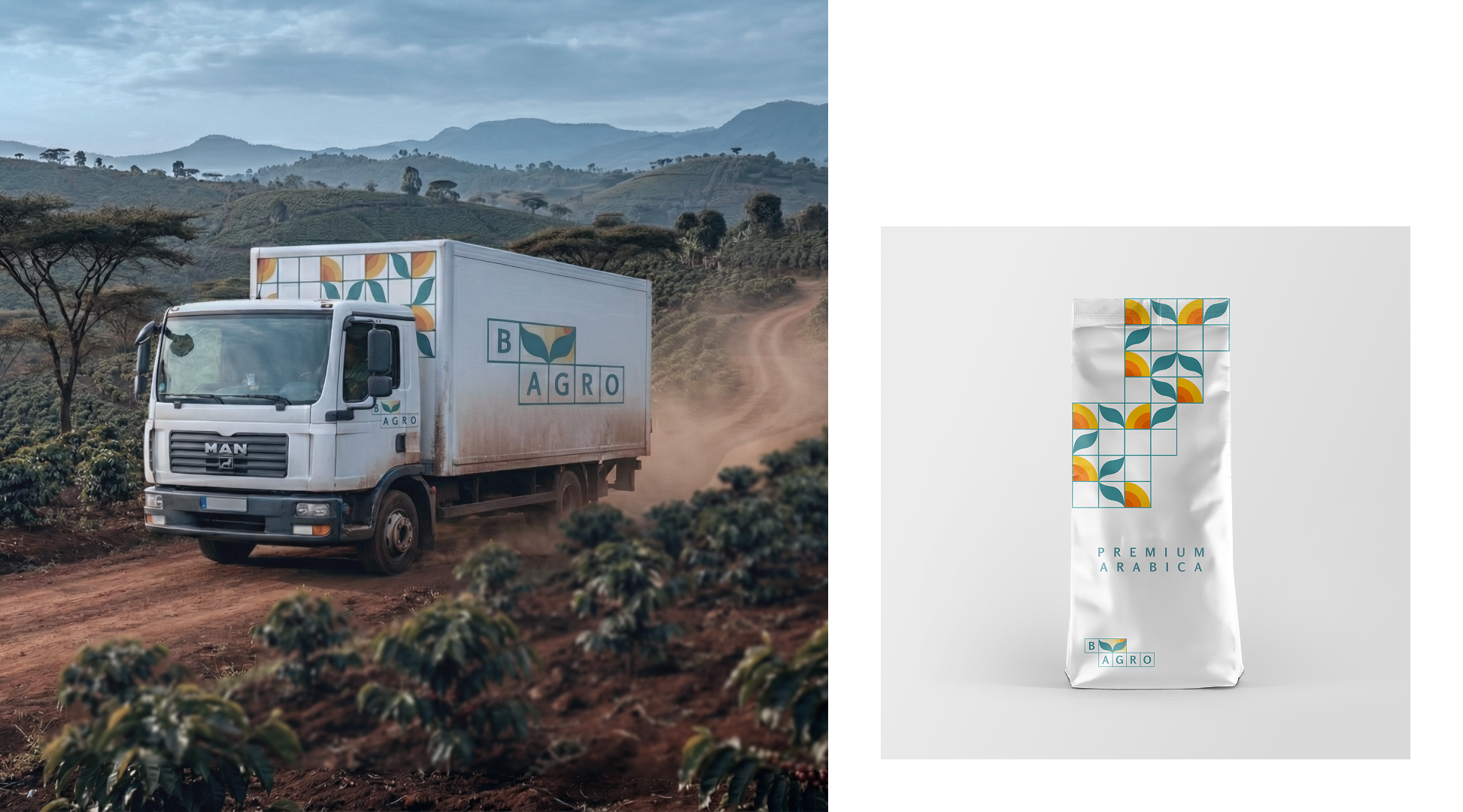
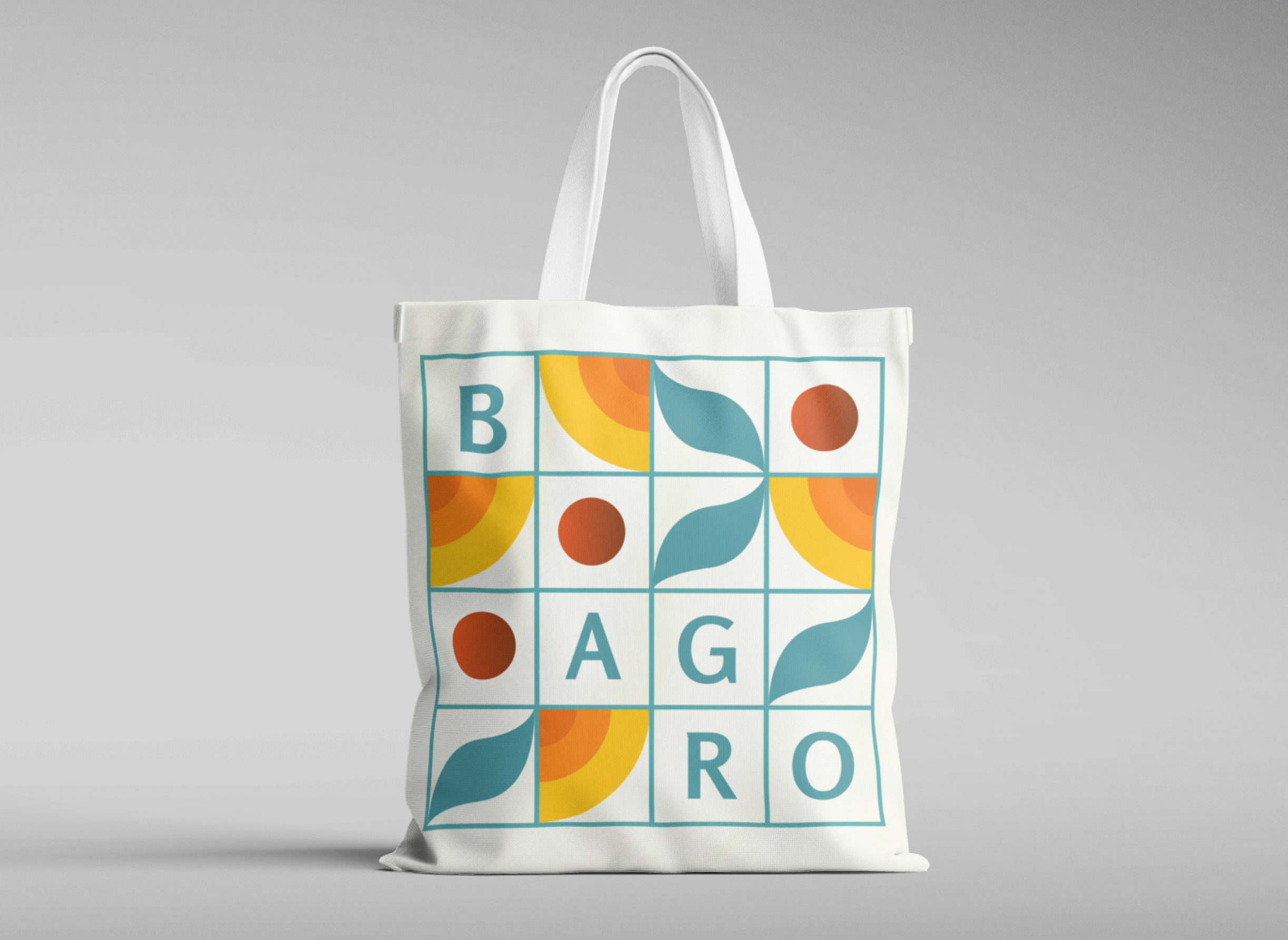
The B-Agro grid
The identity system was built around a grid structure inspired by agricultural planting systems the organised, methodical way crops are laid out across land. This became the foundation for the logo and extended into patterns and layouts across all applications. It gave the brand a visual logic rooted in the actual work of farming rather than a generic interpretation of it.
Logo and colour
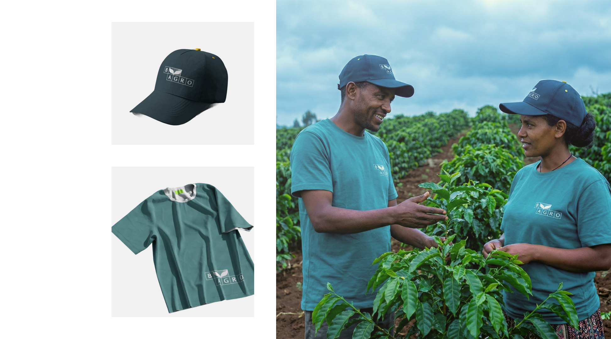
The logo combines the BAGRO name within the grid alongside organic leaf forms referencing coffee plant growth, geometric structure meeting natural form. The colour palette balances cool blue-green tones communicating trust and reliability with warm yellows and oranges drawn from coffee fruit at harvest. Neither set of values cancels the other out.
Photography direction
Photography guidelines focused on cultivation environments and farming communities crop details alongside broader landscapes. The intention was that every image should communicate both the scale of the operation and the human hands behind it.


What I'd do differently
I'd push the grid system further into the digital applications. The identity is strongest on physical materials, packaging, merchandise, transportation, where the agricultural logic of the grid feels tangible. On screen it has less room to breathe. With more scope I'd have developed a digital-first expression of the same system that felt as considered as the print work.