Vouchsafe
Inclusive Identity made simple
Context
Vouchsafe helps businesses verify people automatically and inclusively. I joined as the sole designer at an early stage, responsible for brand identity, product design, and design system across both sides of the platform, the business dashboard and the consumer-facing verification flow.
Problem
Identity verification tools are typically built for the businesses deploying them, not the people going through them. The people who most need access, those without traditional documentation, those navigating systems in a second language are the ones most likely to fail or abandon the process entirely.
Goal
Build a verification experience that works for both audiences without compromising either. Businesses needed a tool that was fast to integrate, professional, and compliance-ready. Users needed something that felt simple, safe, and legible regardless of language, device, or familiarity with digital systems.
Mapping two journeys with competing needs
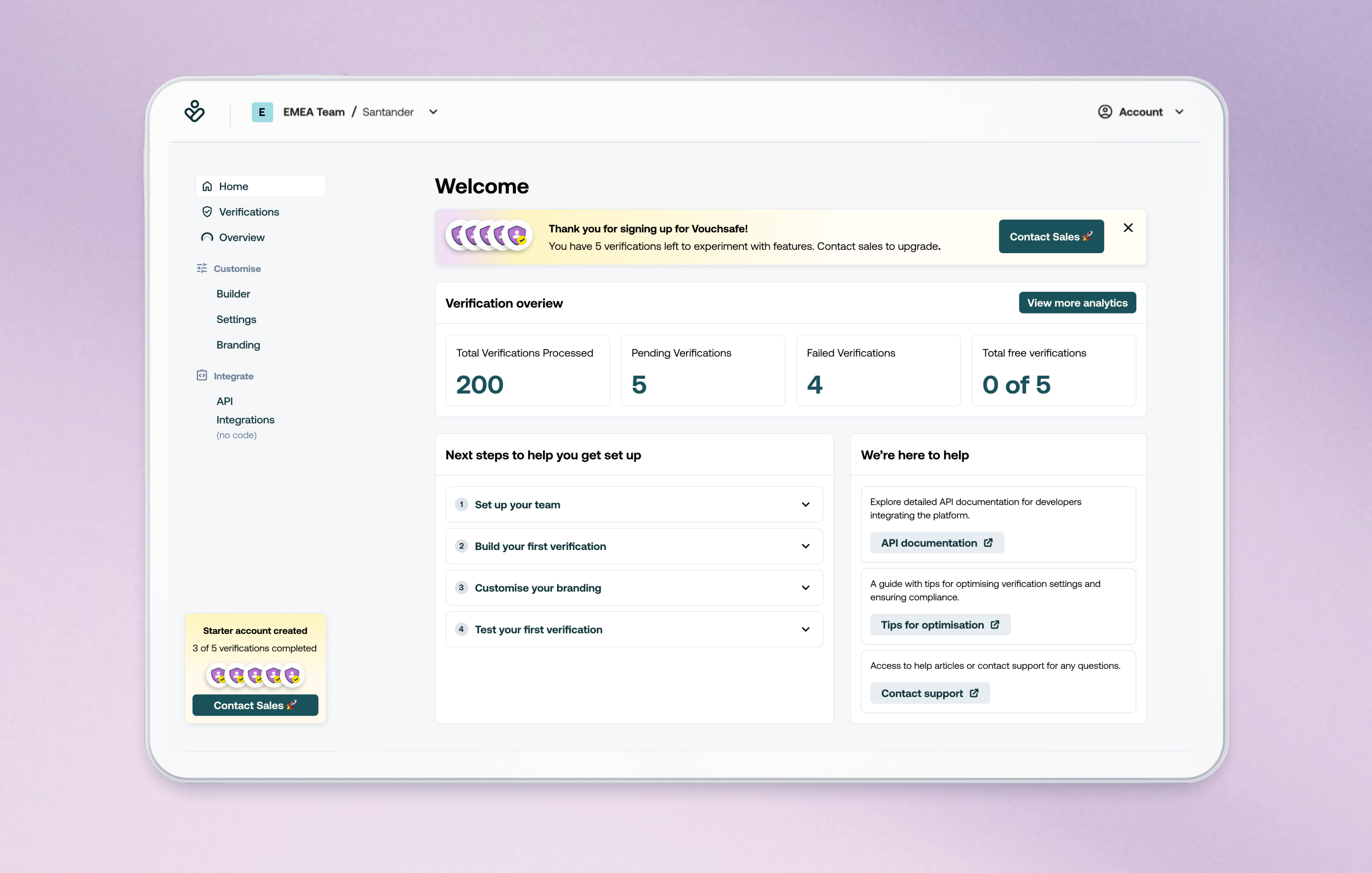
I mapped two distinct user journeys: the business configuring and managing verification flows, and the end user going through verification. The gap between what each audience needed; professional confidence versus human simplicity, became the central design tension for every decision that followed.
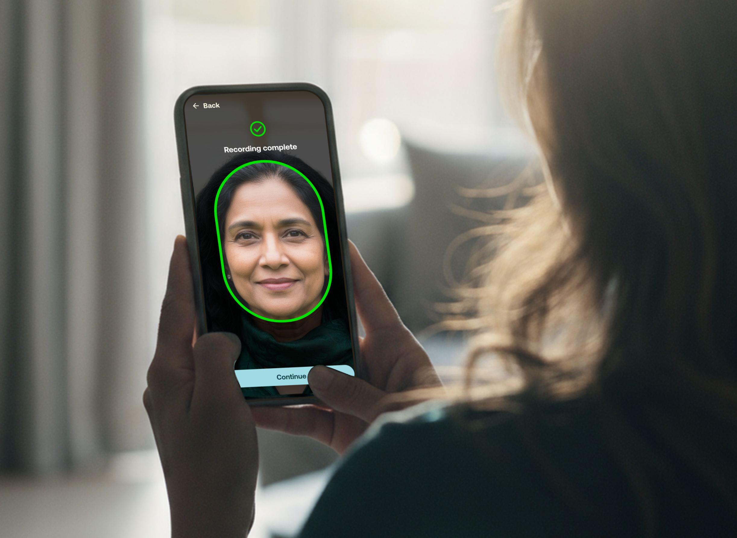
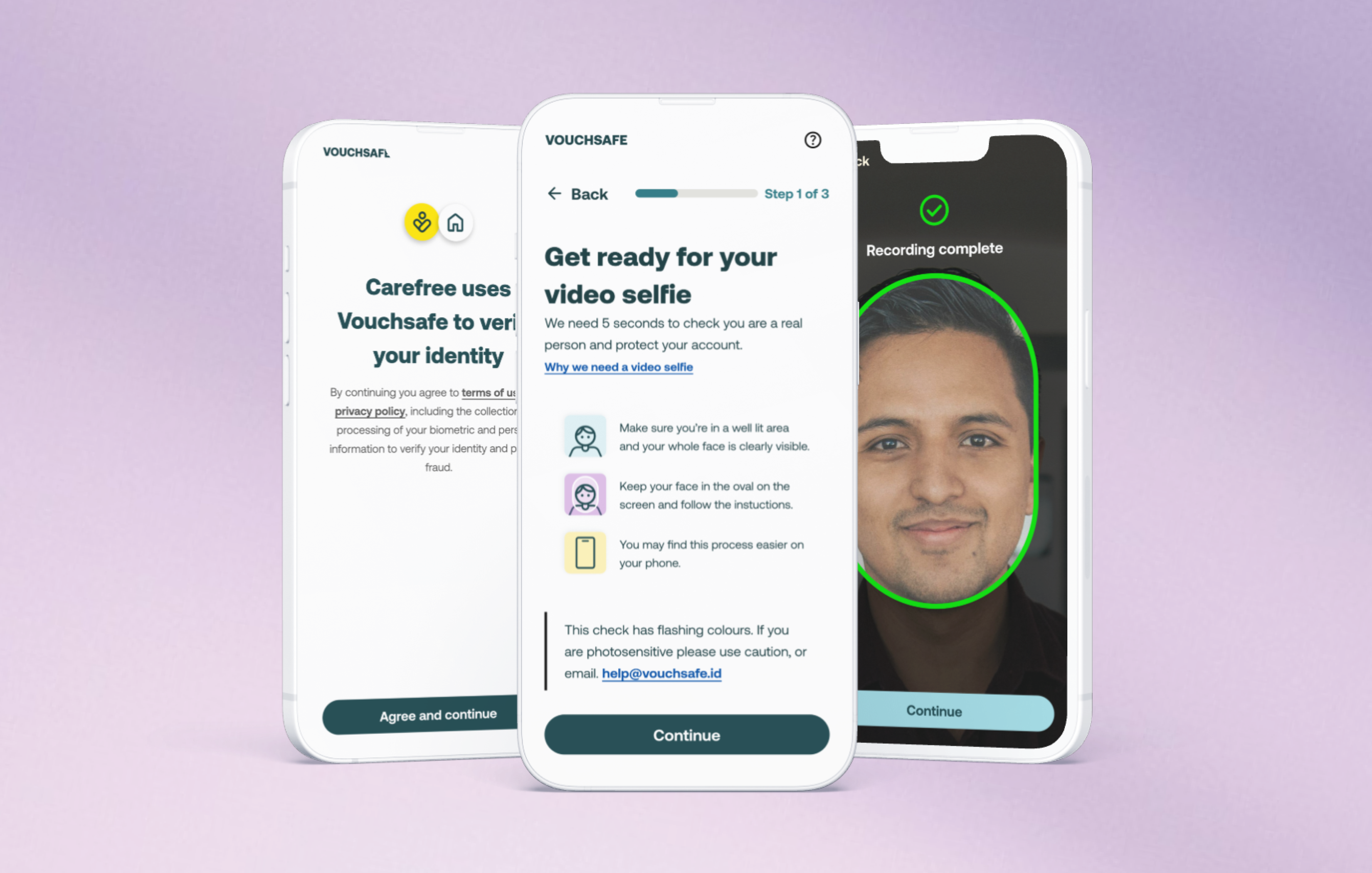
The language problem
The hardest design challenge wasn't visual. It was language. The consumer side needed plain, warm, translation-ready copy, because the product was explicitly designed for underserved communities who might be navigating it in a second language. Visuals had to carry meaning independently of text, so that concepts were understood even where translation was imperfect. The business side needed the opposite register: competent, professional, compliance-aware. Maintaining both within one product without either feeling compromised required a strict split in tone, component language, and content hierarchy across the two interfaces.
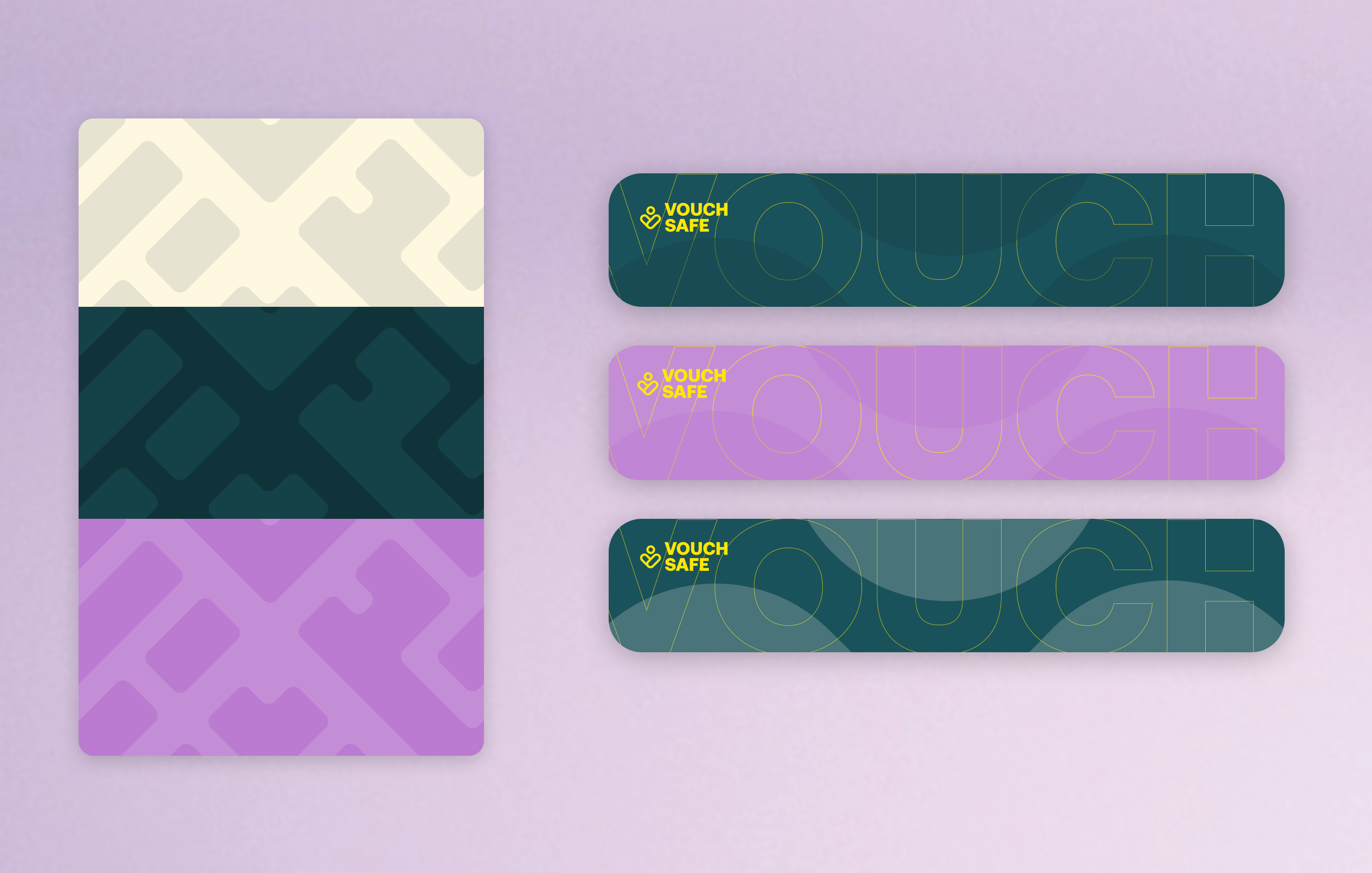
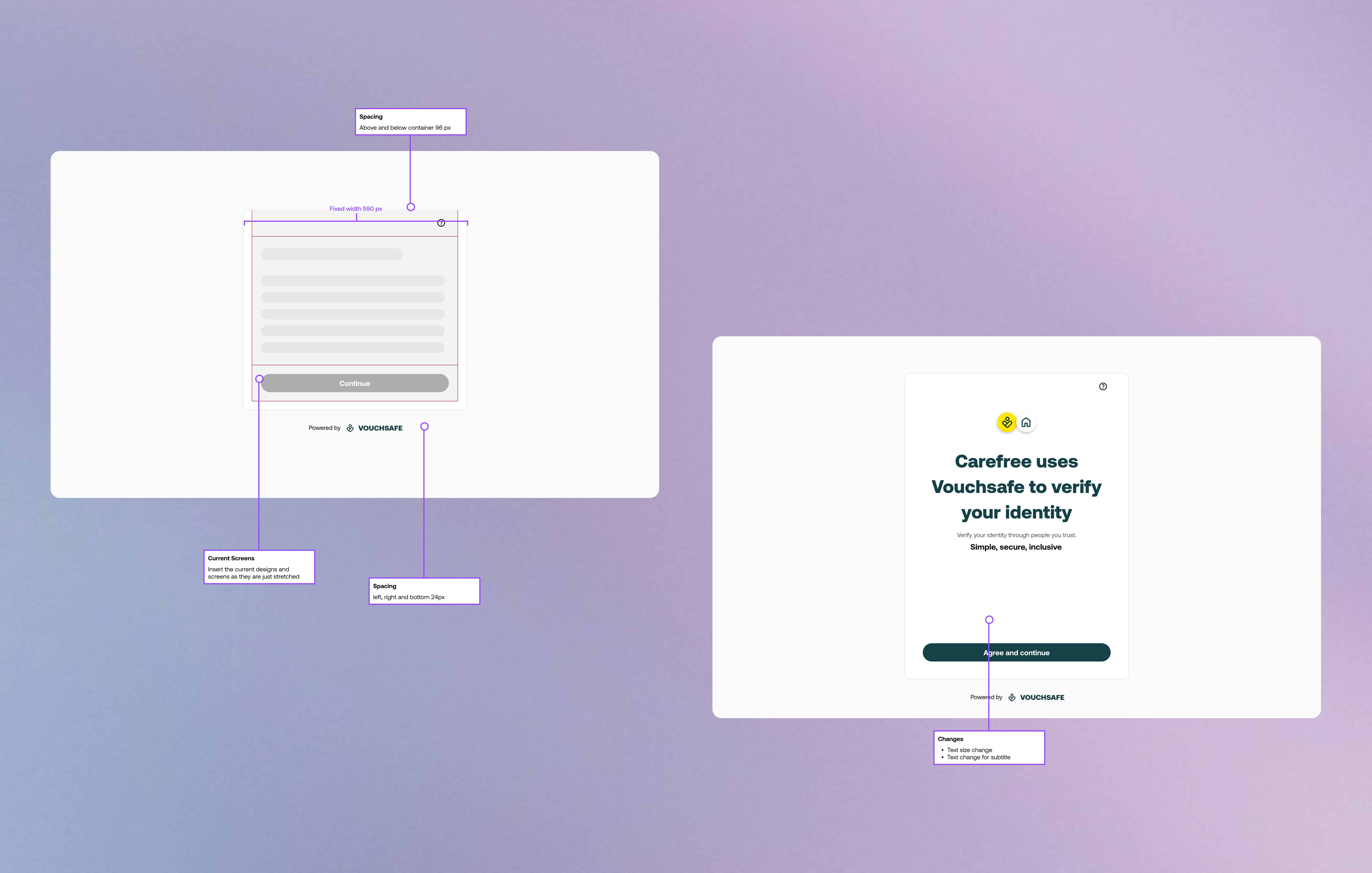
Building a white-label system that didn't need rebuilding
The consumer-facing verification flow had to sit inside any client's existing platform without breaking visually. Designing for that meant building a component system flexible enough to inherit any brand's colours, typography, and radius values while keeping the core experience intact. Mobile-first throughout, because the users we were designing for were far more likely to be on a phone than a desktop.
Communicating trust without overexplaining
Understanding how Vouchsafe identified fraudulent behaviour was important not to surface it in the UI, but to be able to explain it clearly to new enterprise stakeholders and in onboarding materials. Trust at enterprise level is built partly through design and partly through how confidently you can answer the question: how do you know this works?
Strategic considerations
User testing on the consumer side was my biggest deprioritisation and my biggest regret. The whole USP of the product was inclusive verification, but we shipped without testing with the underserved communities we were designing for. At an early-stage startup moving fast to generate revenue, it was the right business call. It wasn't the right design call.
Built-in accessibility tools, voice reader integration in particular, were scoped out for the same reason. The product was designed to serve people that mainstream verification tools exclude, and we still shipped without the accessibility layer that would have made that claim fully true. That tension sat with me throughout the project.
Translations were deprioritised despite being central to the product's mission. The architecture was designed with translation in mind; short strings, visual-first hierarchy, no idioms, but the actual translation work didn't happen at launch although the foundation for it to happen in the future was there.
What I'd do differently
I'd push harder for one round of user testing with the consumer audience before launch, even if itwas shorter informal sessions. We were building for communities we weren't fully representing in our process. The design reflects good intentions. howerver, it should have reflected direct input.