Raspberry Pi Foundation
A code editor for kids everywhere
Context
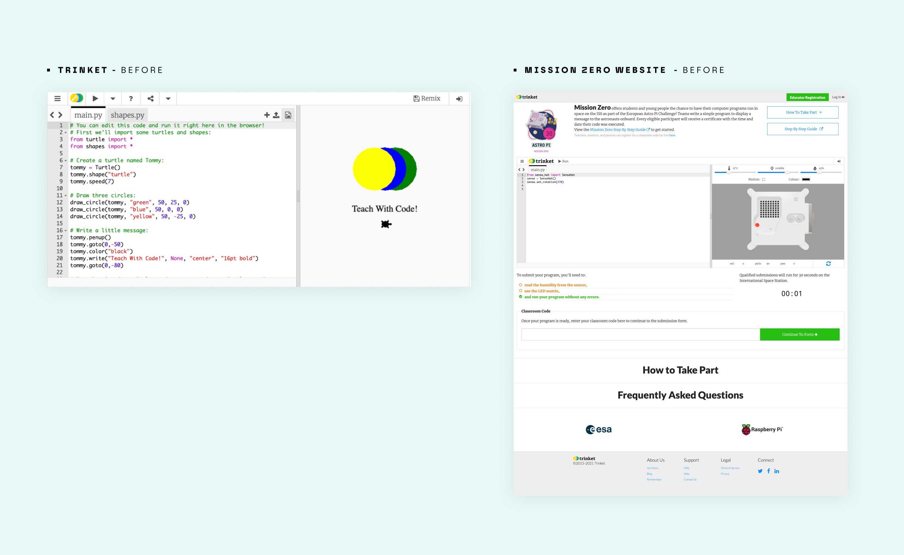
Raspberry Pi had been using Trinket, an open-source code platform embedded across multiple Foundation products. It worked, but it was borrowed infrastructure with real limitations: no control over the experience, no ability to adapt it for a specific audience, and no way to serve the range of contexts the Foundation needed. The decision was made to build their own. I was the designer from day one.
Problem
The brief was technical. The real problem was human. Most code editors are optimised for speed and power. This one had to optimise for something different: the feeling that you can do this. The moment a child hits an error they do not understand is the moment they close the tab. Every interface decision either prevents that moment or causes it. There is no neutral ground. External feedback after launch confirmed this. Reviewers noted the absence of Intellisense-style prompting as a significant gap for beginners, and early versions required learners to switch between instructions and the editor in separate tabs, adding friction at exactly the moment focus mattered most.
Goal
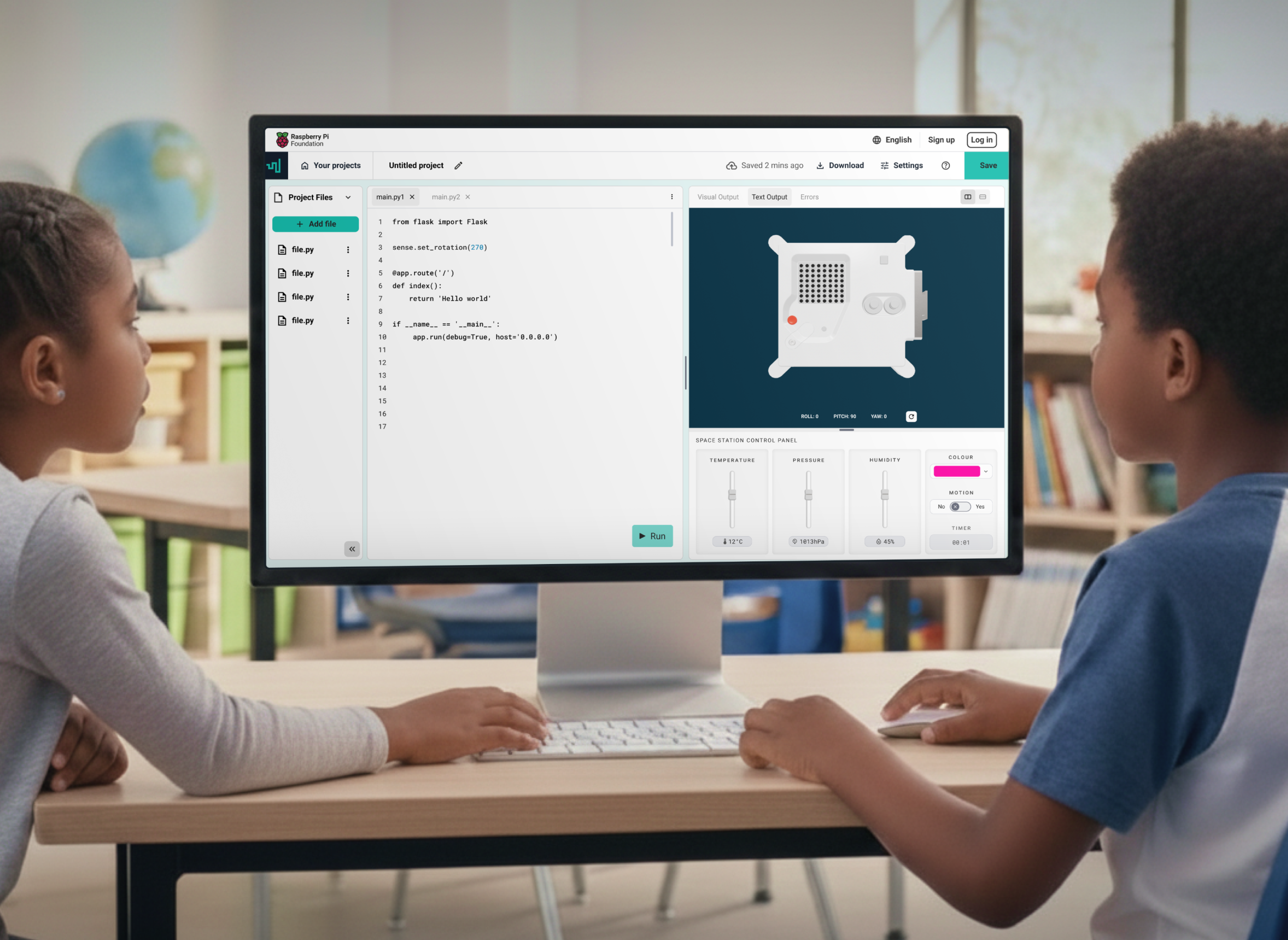
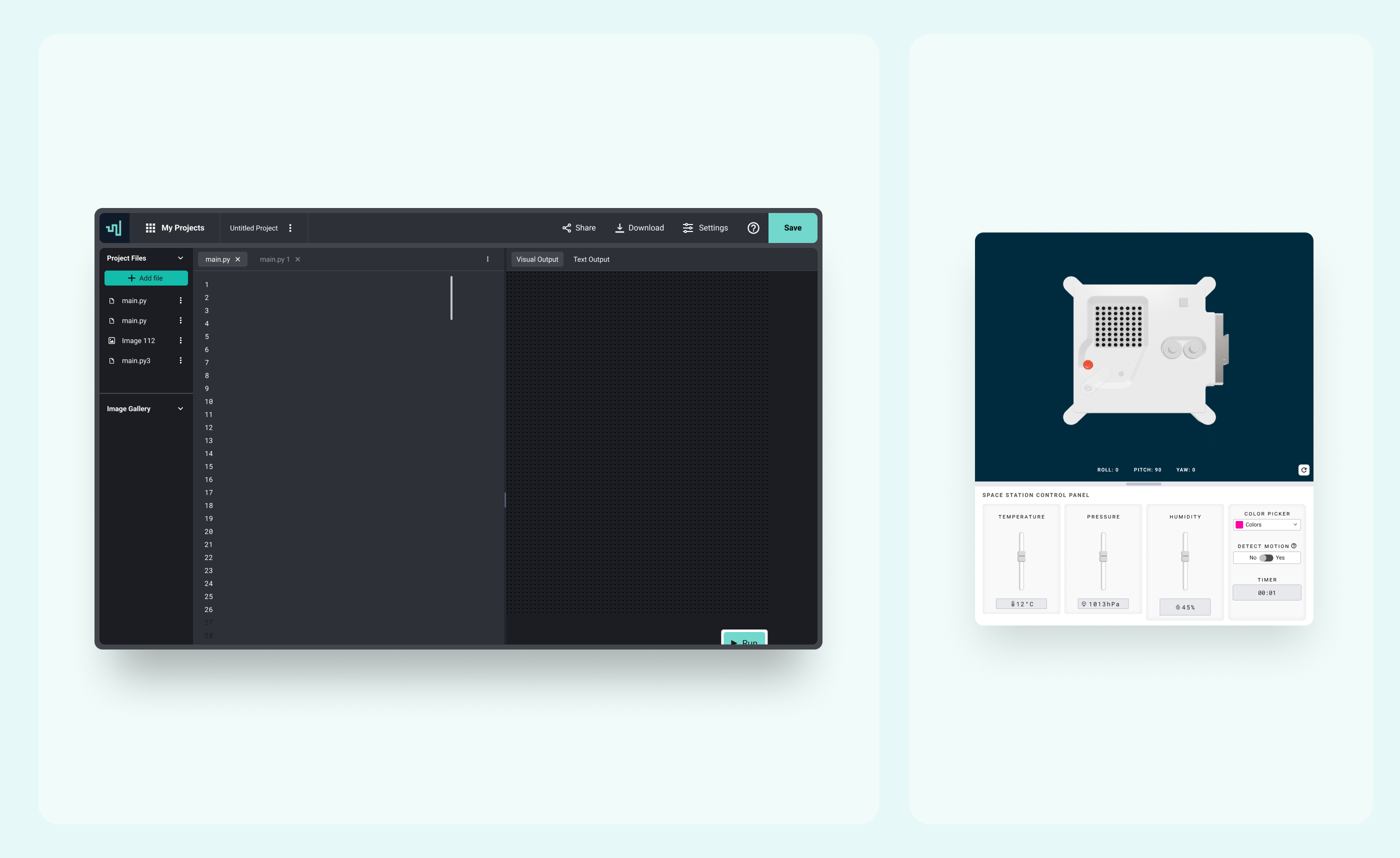
Build a code editor that feels simple and approachable for the widest possible audience: a seven-year-old in a classroom, a student at a Code Club, a young person at home, and a student writing code for the Astro Pi Mission Zero programme. It had to adapt across contexts, work on low-cost devices including the Raspberry Pi 4, and operate within school safeguarding constraints that were non-negotiable from the start.
Research and considerations
The product did not have a formal research phase before build. What it had instead was a deeply specific brief, a well-understood audience, and a Foundation with years of experience teaching children to code. That knowledge shaped every constraint. After launch, user behaviour and external feedback became the research. The data told a clear story.
Returning users were the signal that mattered most
A 440% growth in authenticated, saving users was not just a usage metric. It meant children were coming back. In an educational tool, return visits are the measure of whether something actually works.
The error message problem was real
Early feedback and usage patterns confirmed what the brief had anticipated: the gap between a technical error message and a human one is the gap between a child who keeps going and one who closes the tab. This validated the decision to rewrite every system error message with the same care as the interface itself, working directly with engineering rather than handing off a spec.
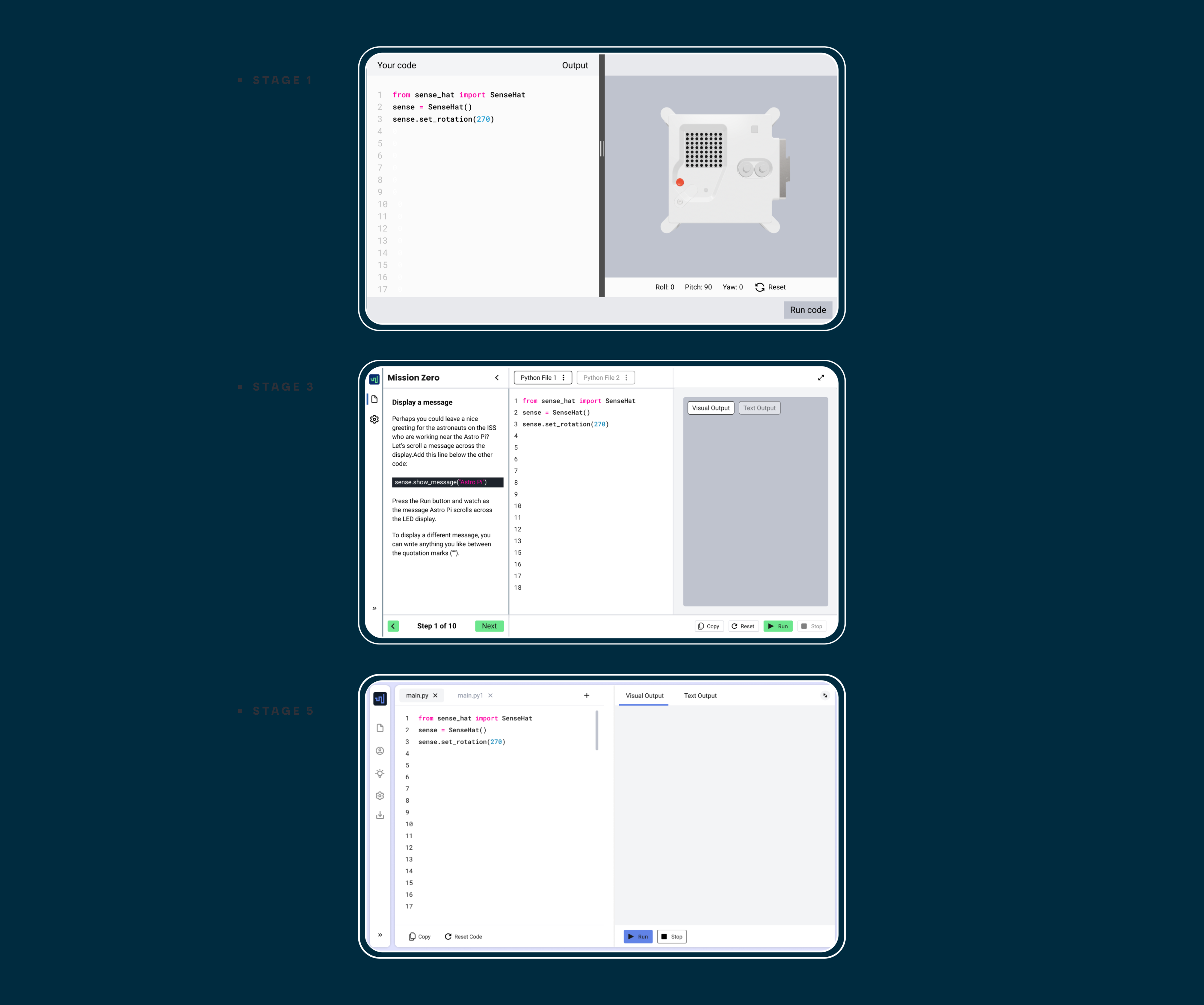
Instructions and code needed to live together
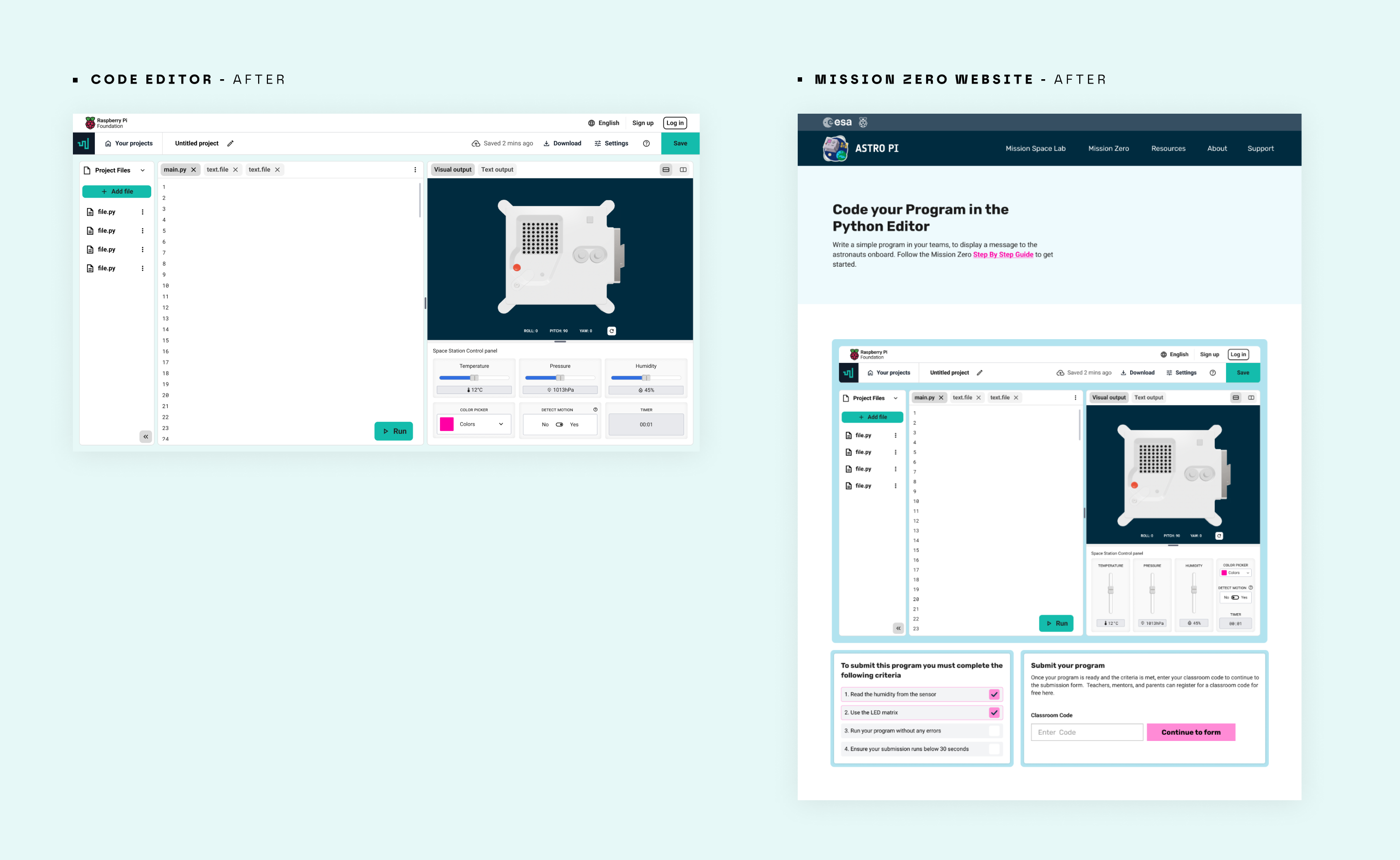
External reviewers flagged the tab-switching problem immediately. Bringing instructions and the editor into a single interface was an explicit goal from the outset and a direct response to how children actually work.
The audience was not one person
Code Clubs, CoderDojos, classroom teachers, home learners, and Astro Pi participants all used the same editor for different purposes on different devices. Designing for one meant designing for all of them simultaneously.
Design
Six wireframe stages before committing to anything
The constraints were genuinely competing: minimal features, clear hierarchy, fast to build, and scalable as the product grew. Six rounds of wireframing and stakeholder feedback were needed to hold all of those constraints without sacrificing any of them.
Error messages as interface design
Rewriting every error message was not a content task. It was a design decision. The difference between "SyntaxError: unexpected token" and "Something is off on line 4, here is what might help" is the difference between a child who continues and one who gives up. I worked directly with engineering on implementation to make sure the messages landed as designed, not just as specified.
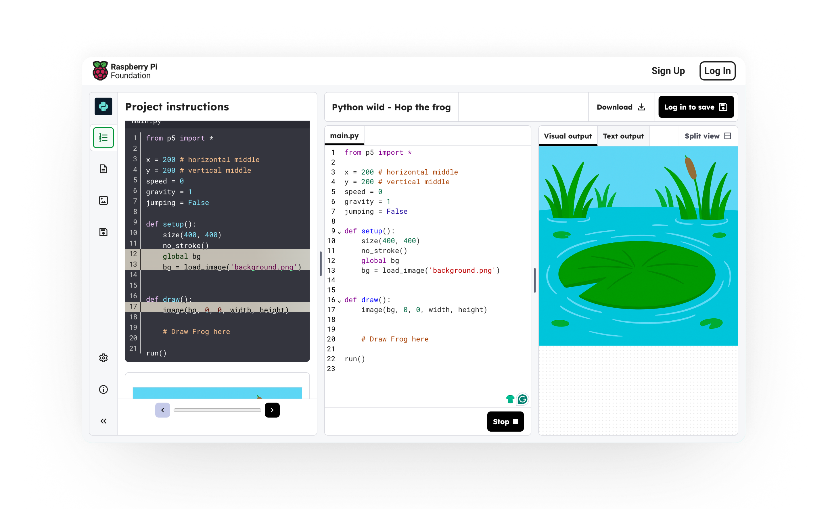
One editor, multiple contexts
The editor had to function as an embedded display within the Projects site, as a standalone tool for Astro Pi, and as a classroom tool on devices ranging from tablets to projectors. Responsive layouts, flexible type sizing, and an accessibility-first approach to contrast meant a child reading from the back of a classroom had the same experience as one sitting in front of the screen.
Every feature decision filtered through one question
Is this safe for a school environment, and does it serve the learning without distracting from it? That filter shaped what was built and what was deliberately left out.
Image uploads were removed entirely
An open upload function in a tool used by children creates safeguarding risks that no design solution fully resolves. Removing it was the right call, not a compromise.
Text size settings solve two problems at once
Accessibility for students with visual needs, and practicality for classrooms where a teacher is projecting onto a screen twenty feet away. One feature, two problems solved.
Dark mode as personalisation, not aesthetics
When someone customises the environment they work in, they feel ownership over it. Ownership increases the likelihood they come back. Dark mode was scoped to a single toggle. Full colour customisation was considered and cut: too many choices in a tool designed to reduce cognitive load works against itself.
Remix was the hardest debate
Letting students copy and build on each other's projects, as Scratch allows, had a strong motivational case. The safeguarding implications and distraction risk outweighed it for the initial release. It is still a decision worth revisiting with a controlled version, where students can view but not copy, or remix only within a teacher-managed classroom.
The product today
78,000 users in the first year. 24,378 young people writing code that ran on the International Space Station. A 398% increase in saved projects. The editor was open-sourced in July 2023, meaning other organisations teaching people to code can now build on it.
The measure was always whether children came back. The 440% growth in returning users says they did.