Creative Quests
A publication for people who forgot how to play
Context
Creative Quests is a global collective exploring curiosity, creativity, and connection through themed immersions. In January 2024, 60 community members spent 30 days exploring Magic and this publication is the result of that collective experience. My role was to design layouts that brought those voices onto the page cohesively, without flattening the diversity of what each contributor brought.
The Problem
The publication was created collaboratively by multiple designers working independently. The risk was fragmentation, a collection of spreads that felt like different publications stitched together rather than one coherent guide. The challenge was finding a visual thread that could hold the whole thing together without overriding anyone's individual contribution.
The reconciliation workshop
Midway through the project, the team held a workshop specifically to reconcile the layouts, because we had each approached them so differently. Rather than forcing a single visual style onto the work, we identified recurring themes across everyone's spreads and agreed on the elements that could be pulled through consistently. That conversation was as much design work as the layouts themselves.
Designing text-heavy spreads that still felt alive
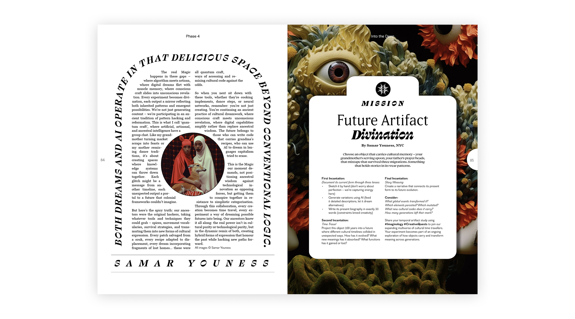
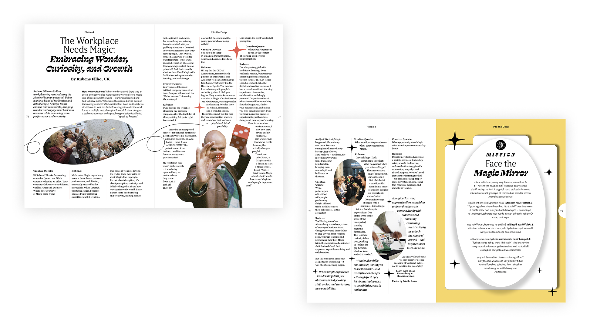
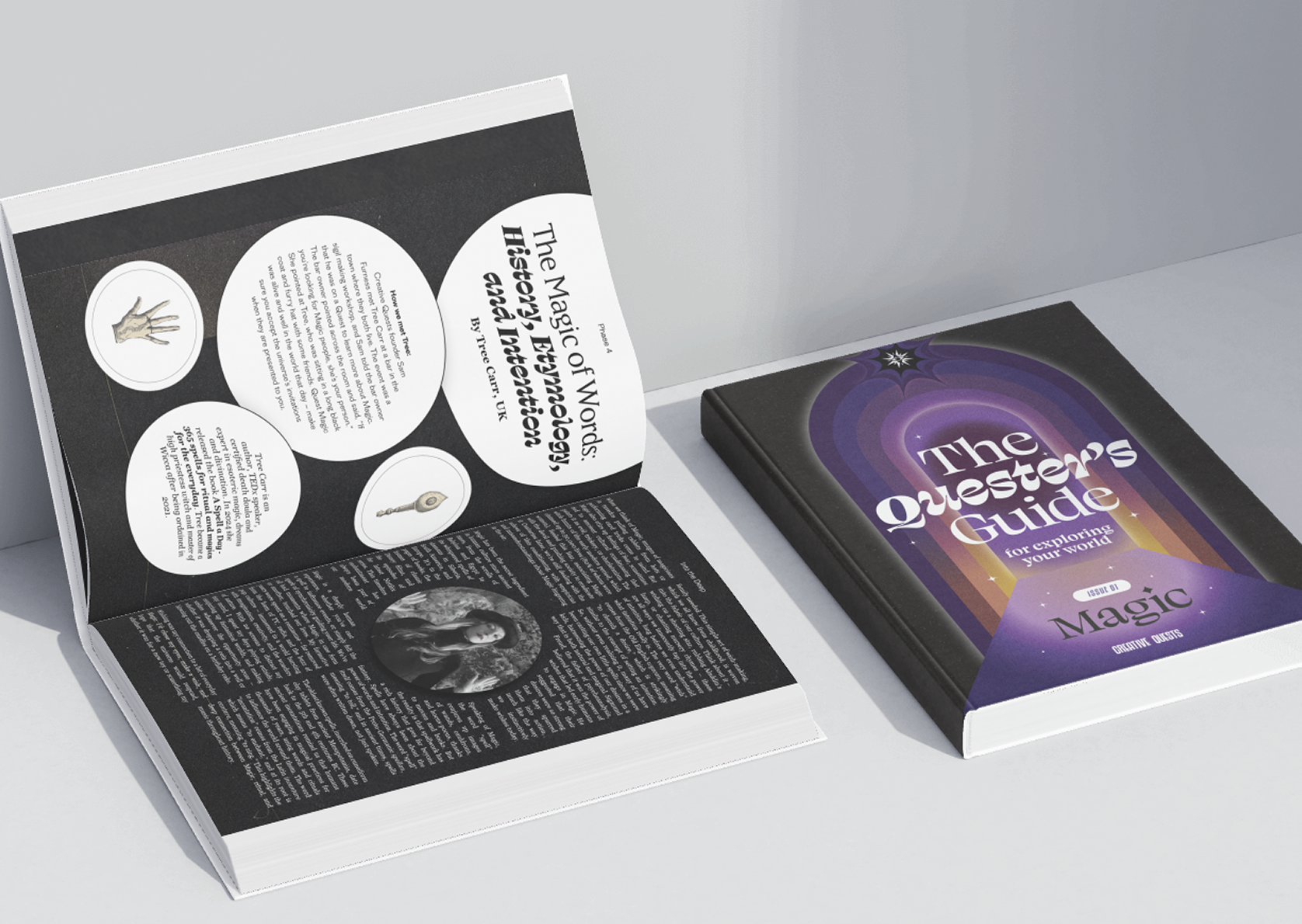
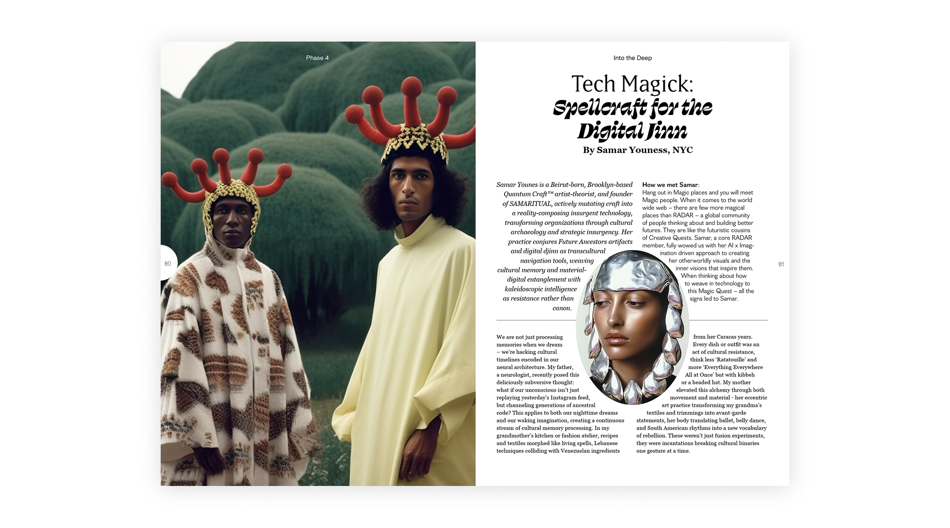
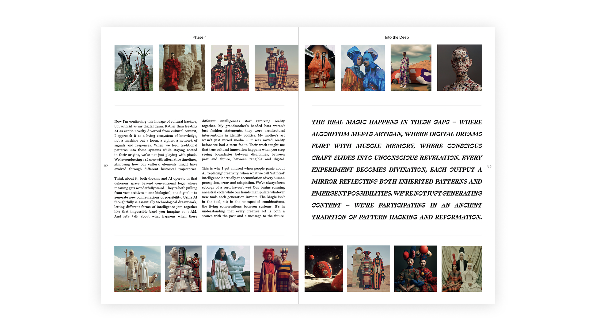
My layouts were among the most text-heavy in the publication, long-form editorials that had to carry the mystical, exploratory register of the project without becoming dense or static. That required detailed typographic decisions: hierarchy, spacing, pull quotes, and the relationship between text and white space working hard on every spread. The goal was that a reader could open to any of my pages and feel the same sense of possibility as the more visually driven spreads elsewhere in the guide.
Fitting the page exactly
Editorial design at print spec is unforgiving. Every layout had to be production-ready, text fitting precisely, nothing reflowing, everything landing where it should on a physical page. Working to Fedrigoni paper specs on a lithographic print run meant there was no room for approximation.

Conclusion
This was a community initiative and the pacing reflected that the collaborative process happened exactly when it needed to. Given more time I'd have committed more to designing the cover, and to supporting the wider consistency work across the full publication. Those are the two places where more of my involvement would have made the biggest difference to the final product.