Genet Collection
A brand identity rooted in Ethiopian craft, designed to travel the world
.jpg)
Context
Genet is a fashion designer and founder who has championed sustainability and women in the workplace throughout a career spanning thirty years in Ethiopia. Her brand — previously called Paradise Fashion — had a strong reputation locally but a digital presence and visual identity that didn't reflect her standing in the industry or her ambitions beyond it.
The problem
The website hadn't been updated in years. The visual identity was inconsistent across touchpoints. Neither reflected the subtlety and refinement of the work itself, or positioned Genet competitively in a western market. The brand needed to catch up with the designer.
The name from Paradise Fashion to Genet
The first and most significant recommendation was to rename the brand. Genet means paradise in Amharic — which meant the existing brand essence was already embedded in her name. Locally and internationally her name carried more recognition than the studio name. Making her the brand was the clearest way to give it legacy positioning, and she accepted it immediately. It was the right call from the start.
Building the visual foundation
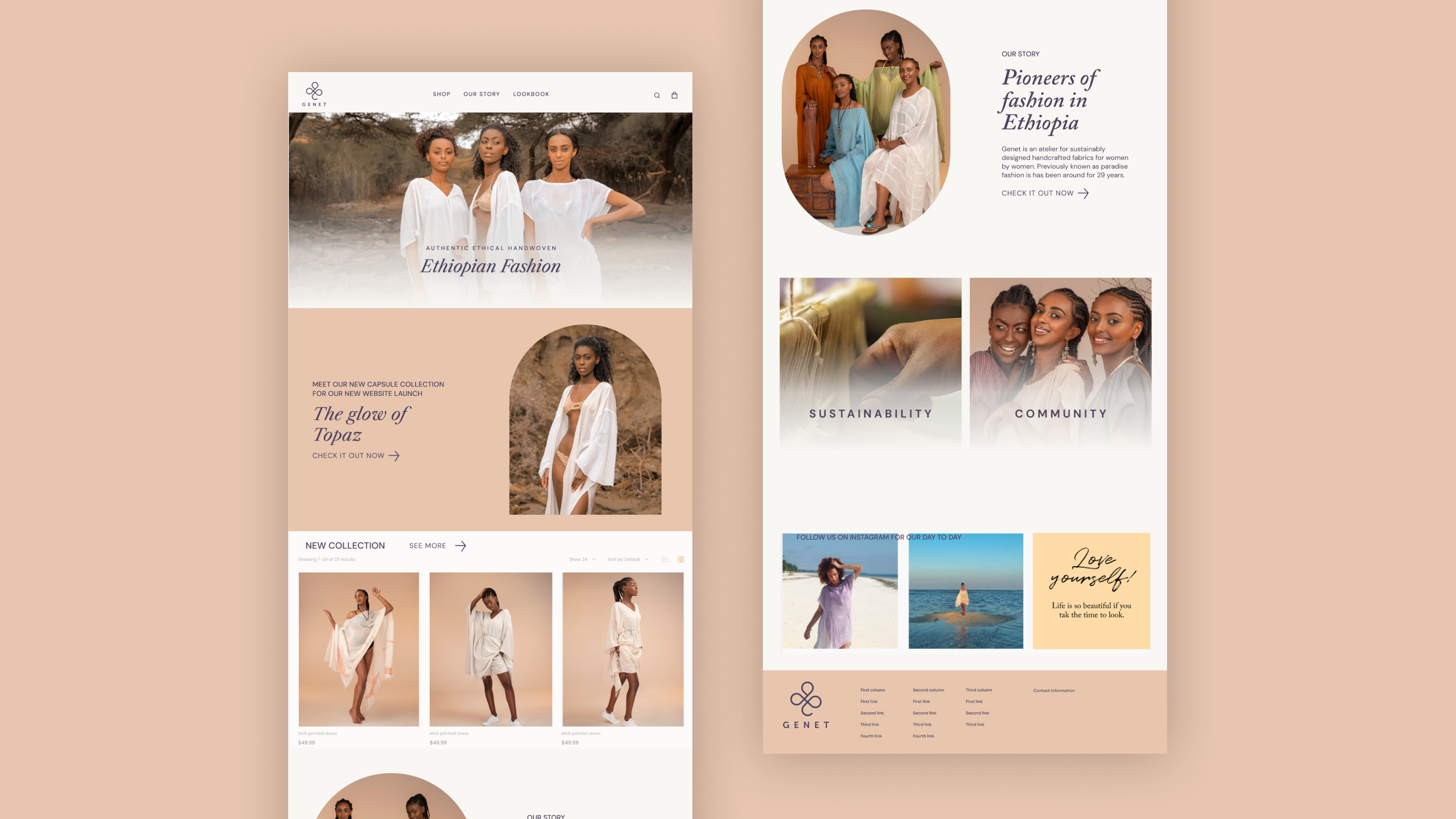
Before any design began, a kickstarter workshop established shared alignment on vision, mission, values, audience, and brand personality. A competitive audit and website audit followed, which produced a clear information architecture for the new site and a positioning statement that led everything: Genet is an atelier for specially designed handcrafted fabrics for women by women.
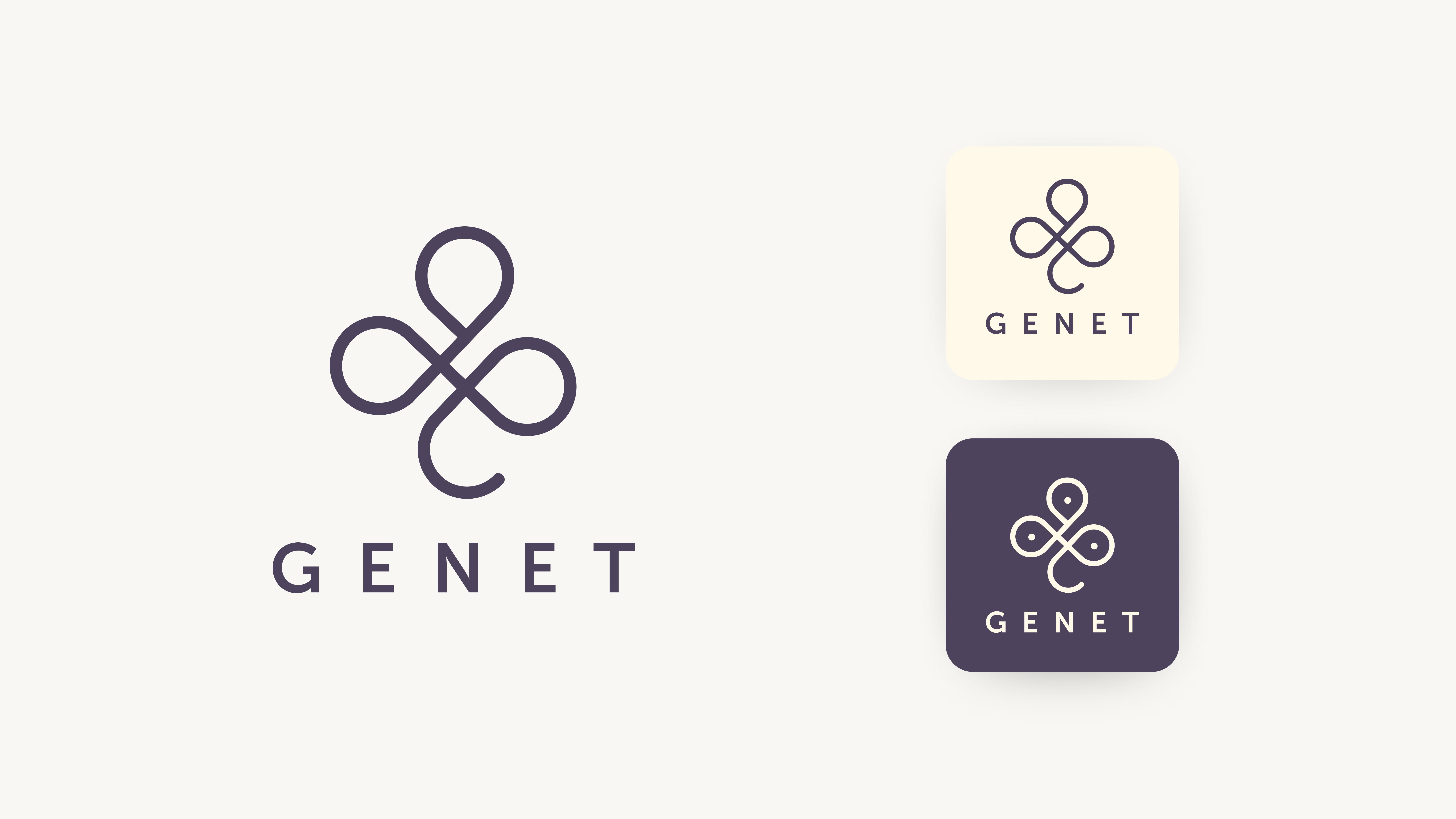
The logo and identity
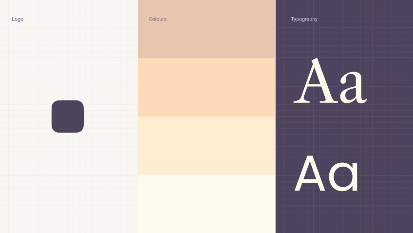
Taking inspiration from Ethiopian Christian geometry, Amharic symbolism, and the infinity sign for paradise, the logomark was built around the four-leaf clover; a symbol of paradise in the Garden of Eden, and simultaneously a G and an E. It needed to feel different from every competitor in the market. It does.
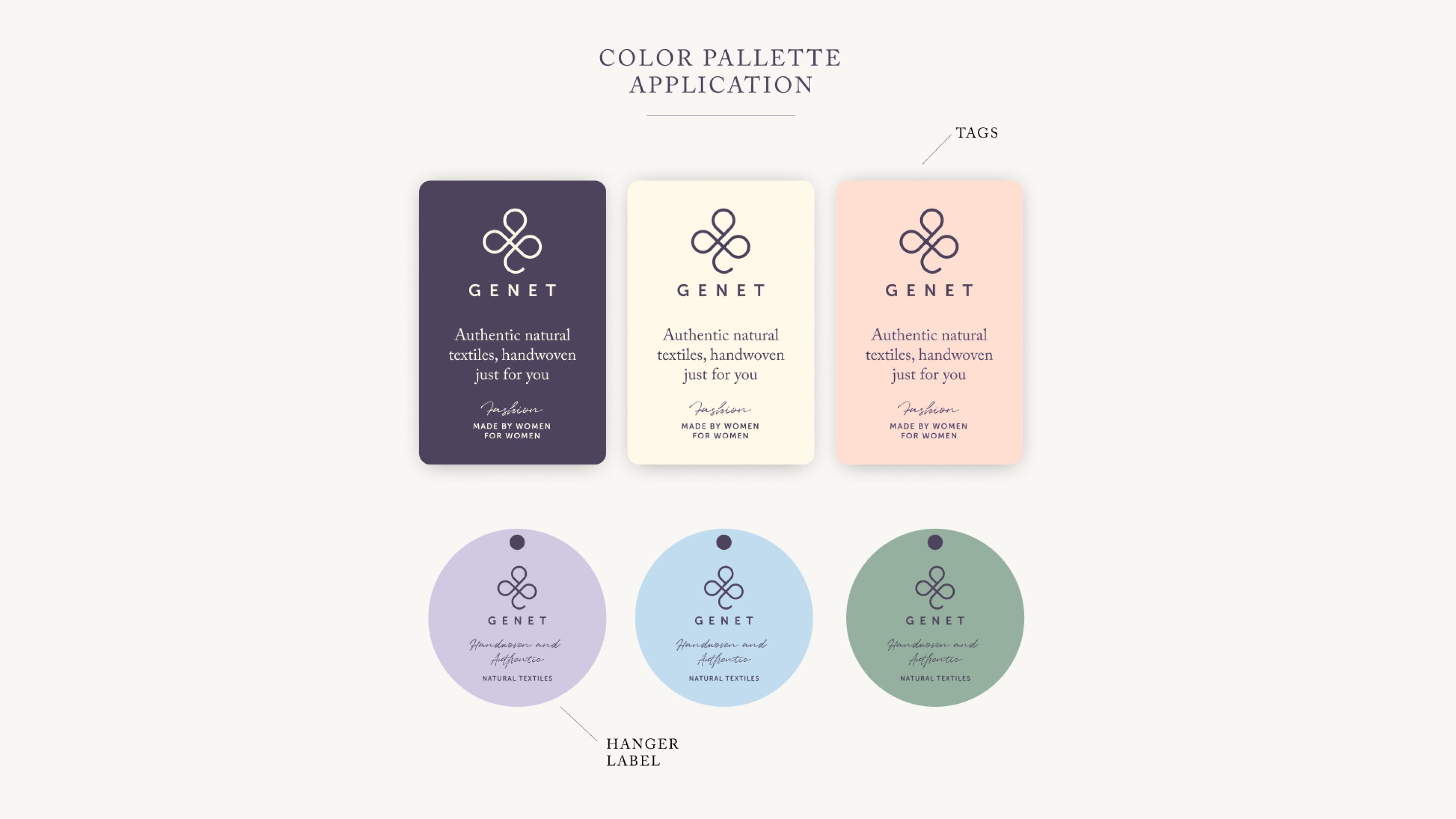
The colour palette uses soft warm coastal tones to reflect the lightness of Genet's materials. Typography combined Museo for headlines, Adobe Caslon for body text, and Quentin as a handwritten highlight, modern backed by history, with a personal touch.
Art direction and photography
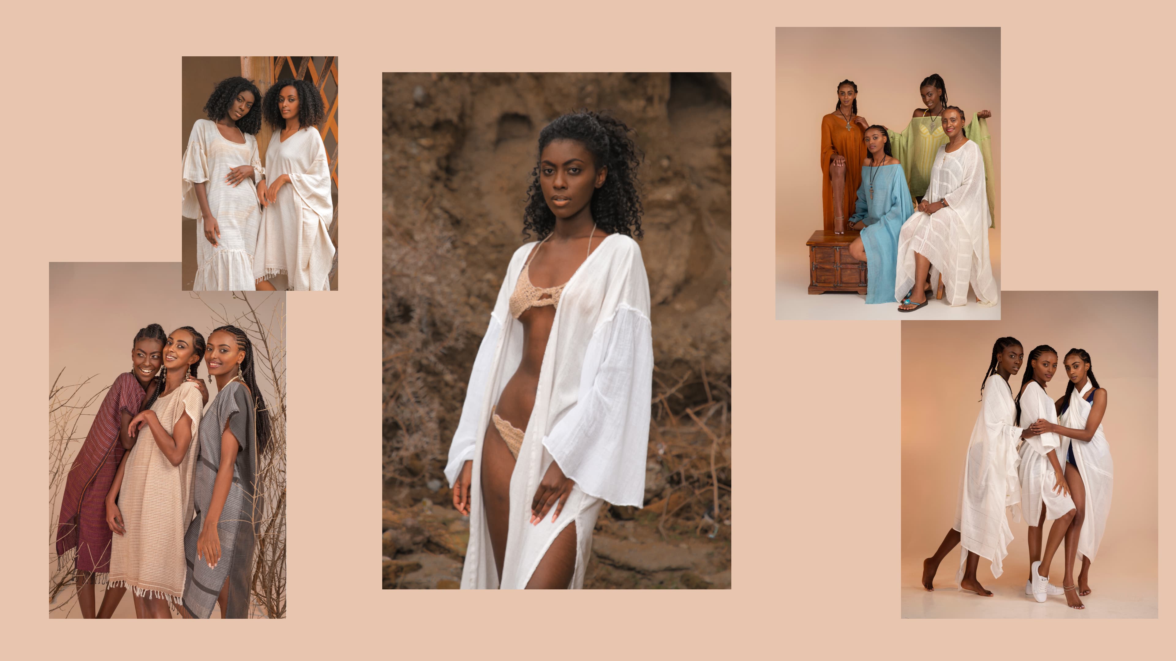
Genet's next collection — Warm Like the Glow of Topaz — became the visual theme for the entire launch. I created photography guidelines, Genet produced the images, and I edited them to ensure they were consistent with the brand. The site and the collection arrived together as one thing.
The website
Built on WordPress with an engineer, the site was designed to tell a coherent story from the first scroll, brand personality, collection, and e-commerce integrated without any of them undermining the others. The constraint was the platform. The result didn't show it.
What I'd do differently
I would have built a blog into the site from the start to document Genet's process, her collections, and the story behind the brand over time. The brand has enough depth and the designer has enough to say that a content layer would have served her well beyond the launch. I'd also have documented more of my own process throughout. It was one of the most collaborative and creatively free projects I've worked on, and more of that should be visible.