Sociability
Empowering social inclusion through frictionless accessibility data.
Context
SociAbility already existed, but the app had outgrown its foundations. While the initial intent was to map accessibility, the product needed to move beyond the simple labels. We needed to provide granular, reliable data that users could actually bet their plans on and make it intuitive for the audience to use.
A competitive review of AccessAble, WheelMap, and AXS Map showed a consistent gap: most tools struggled to balance detail with usability. Either the information was overwhelming, or it wasn't granular enough to be trusted. My role was to evolve the platform into a high-fidelity vision that minimized user effort while maximizing community contribution.
Problem
For people with disabilities, planning a simple outing is not a social activity, it is a "research project." Through my research, we identified that this burden stems from three core challenges:
- The Trust Deficit: Existing platforms lack the specific details, doorway widths, step counts, grab rail placement that a user needs to feel confident before leaving home. Without this, users "do homework" (calling venues or scouring Google Maps) before they are allowed to go out.
- The Friction of Contribution: Users are motivated to help their community, but "endless," clinical forms create a high barrier to entry. This results in stagnant, incomplete venue information that compounds the trust problem.
- The Functional Coldness: Most accessibility tools feel like medical databases. They reinforce a sense of "otherness" rather than making social exploration feel exciting or empowering.
Goal
My objective was to build an information system that people could trust and a contribution system they actually wanted to use. These were two separate product problems that had to be solved together. This shaped three "How Might We" questions that guided every design decision:
- How might we make accessibility information feel fast and frictionless?
- How might we make contributing feel like a game rather than a chore?
- How might we design an interface that feels like a "cool Jarvis", intelligent, warm, and helpful, rather than a clinical database?
Research
Three user groups, not one
We moved away from a monolith view of disability and defined three distinct groups: young, socially active individuals with disabilities; disability professionals researching venues on behalf of others; and "courageous explorers" making do with tools like Google Maps that were never designed for their needs.
Photos first, labels second
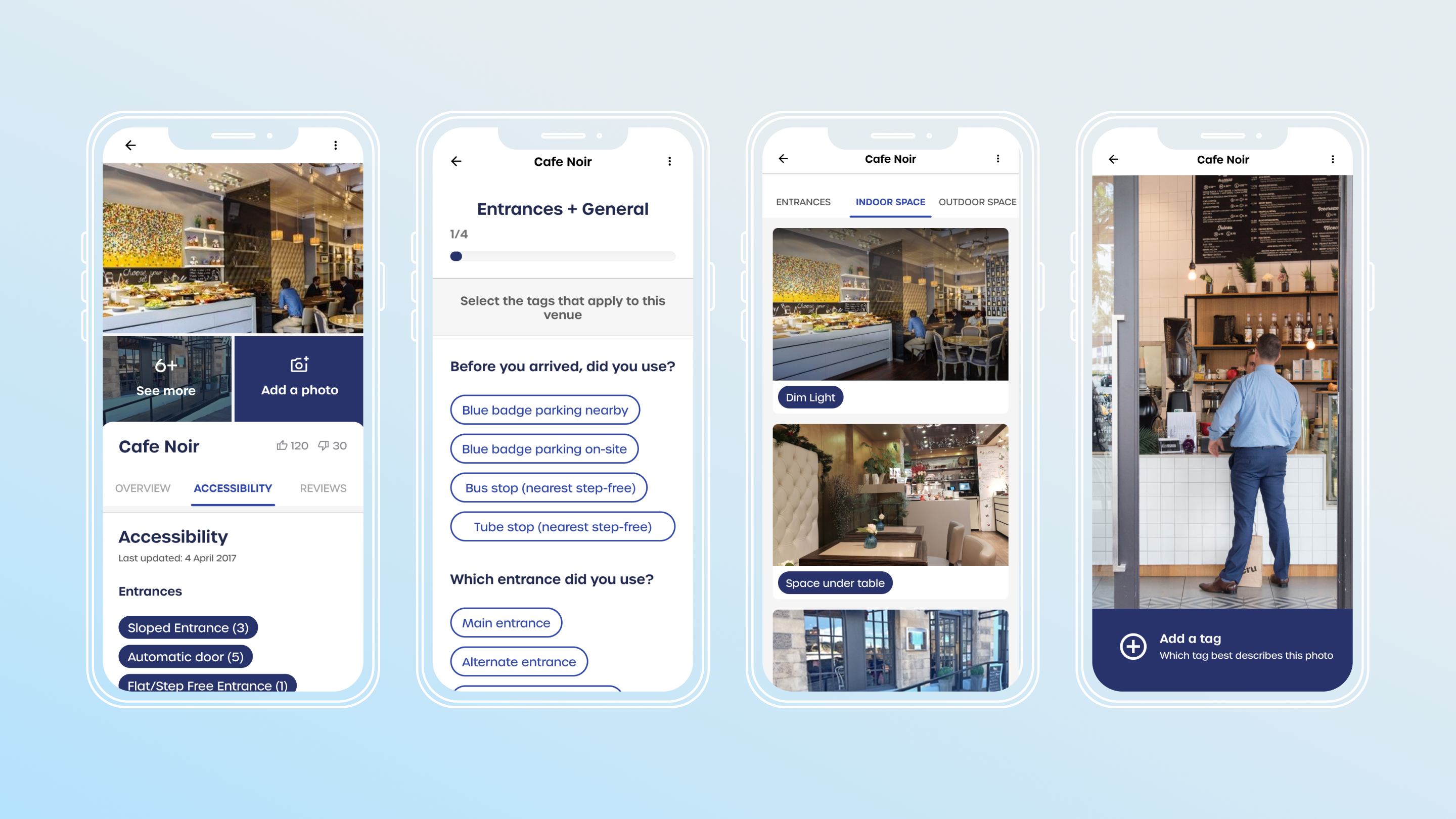
Format mattered as much as content. Users needed to see a space to trust the data. Photos were the highest priority, followed by structured tags, then measurements.
Plain language over technical terms
A focus group on the tags system revealed that generic accessibility terms created confusion. Users preferred everyday language and tappable tags over forms. "I liked that I didn't need to type much" came directly from this research.
Icons need to work without labels
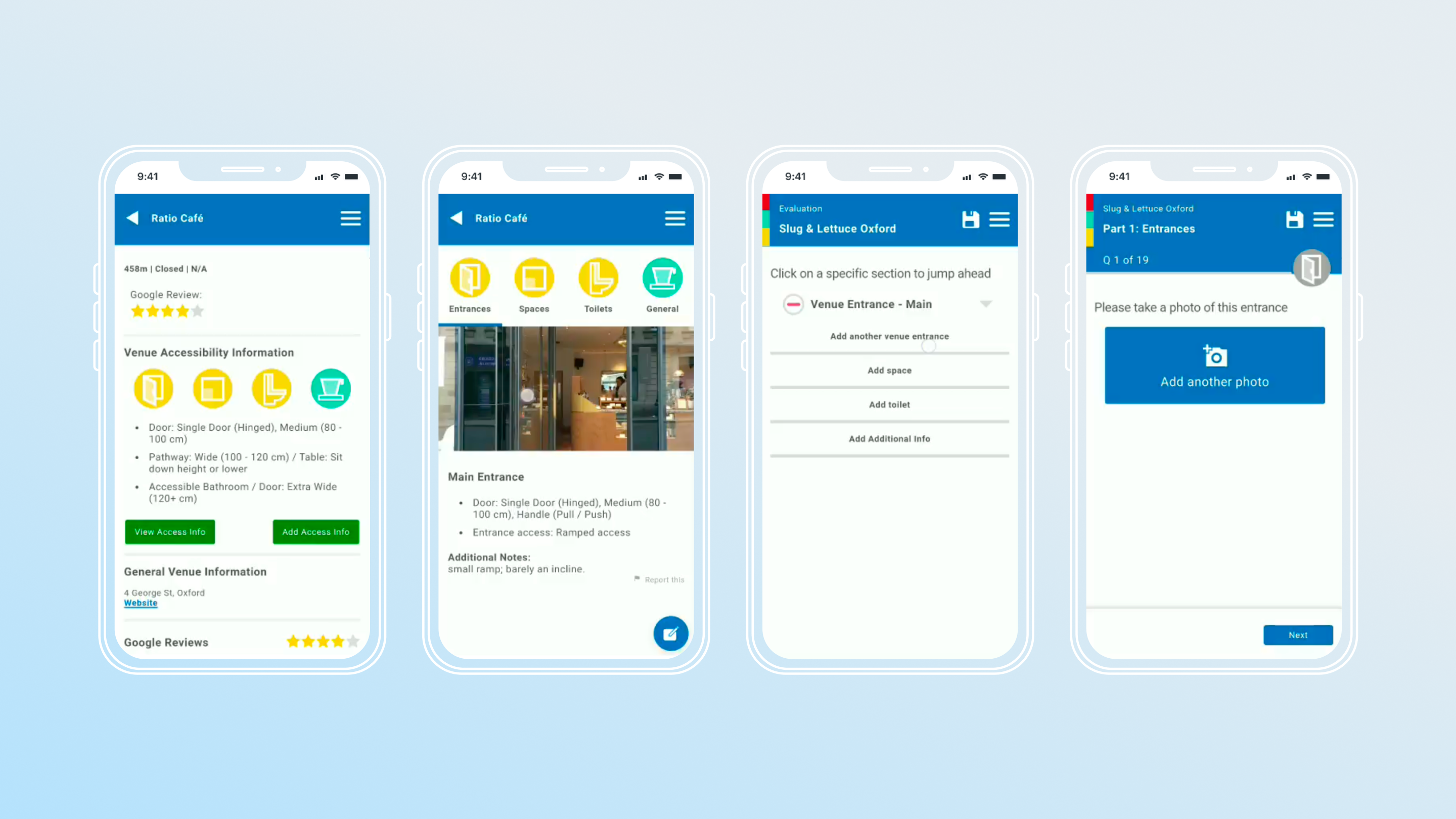
Early icons were not clear on their own. This led to a full review of every symbol in the app against one question: is this understandable without a label?
Design
Two wireframe directions, one clear winner
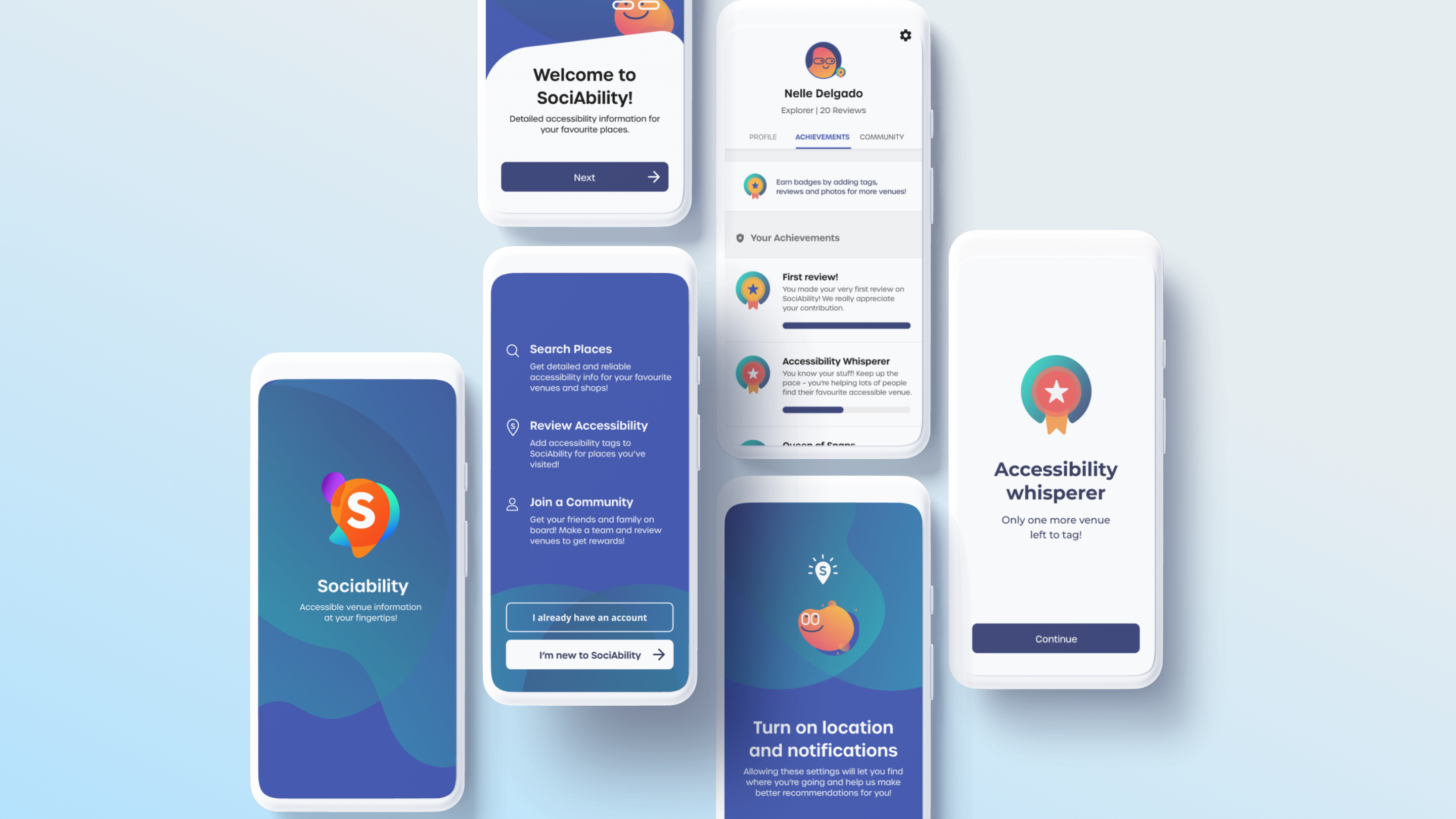
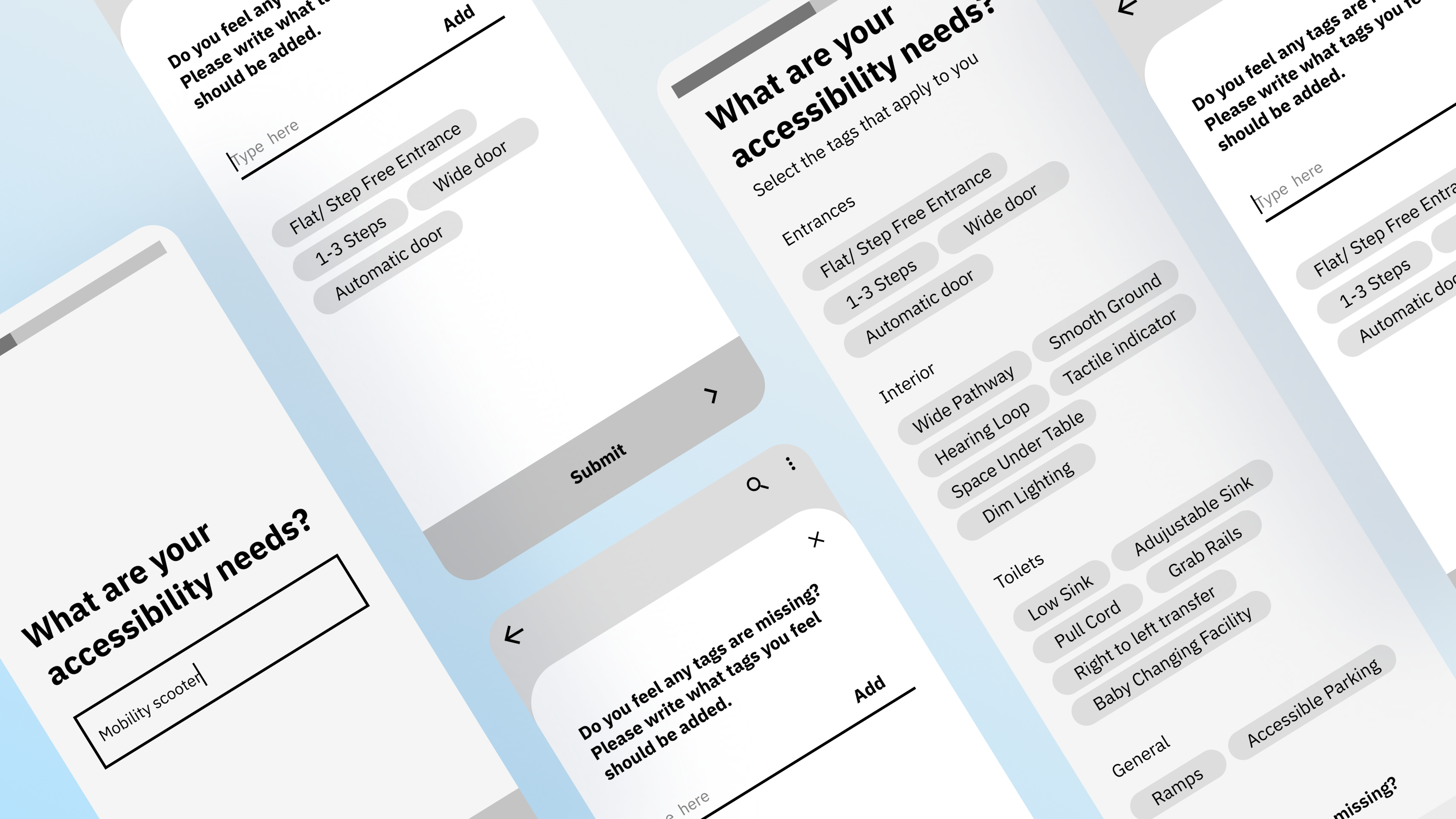
Option 1 asked users for their access preferences immediately. Option 2 showed the value of the app first. Option 2 won: it felt less clinical and got people to the map faster.
Tags in plain language, organised by floor
Tags were reorganised into Entrances, Interiors, and Toilets using everyday language: "sloped entrance" over "ramped access," "dim lighting" over technical lux levels. A floor-by-floor structure was introduced because ground floor and upper floor access are completely different questions, and the original design treated them as one.
From one endless form to three focused pages
The original contribution form had a high drop-off rate. Users described it as endless. Breaking it into three pages with a progress bar and adaptive questions changed that. One quote from testing became a north star: "I liked that I didn't need to type much."
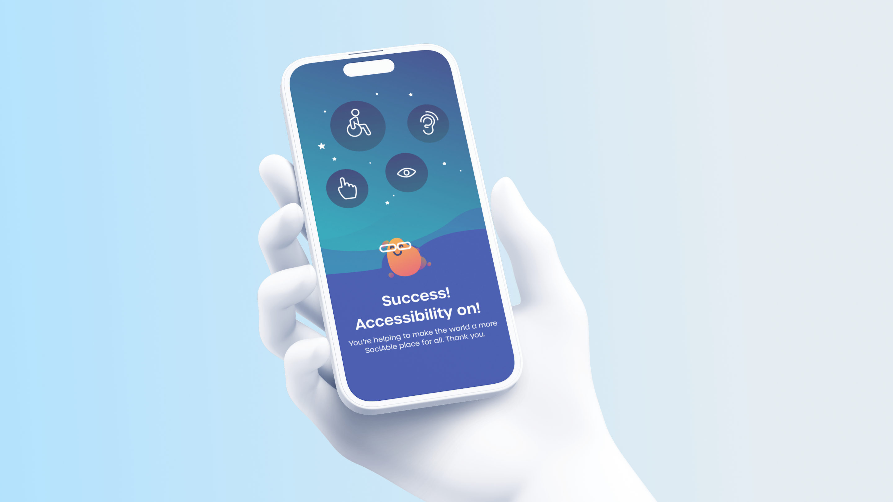
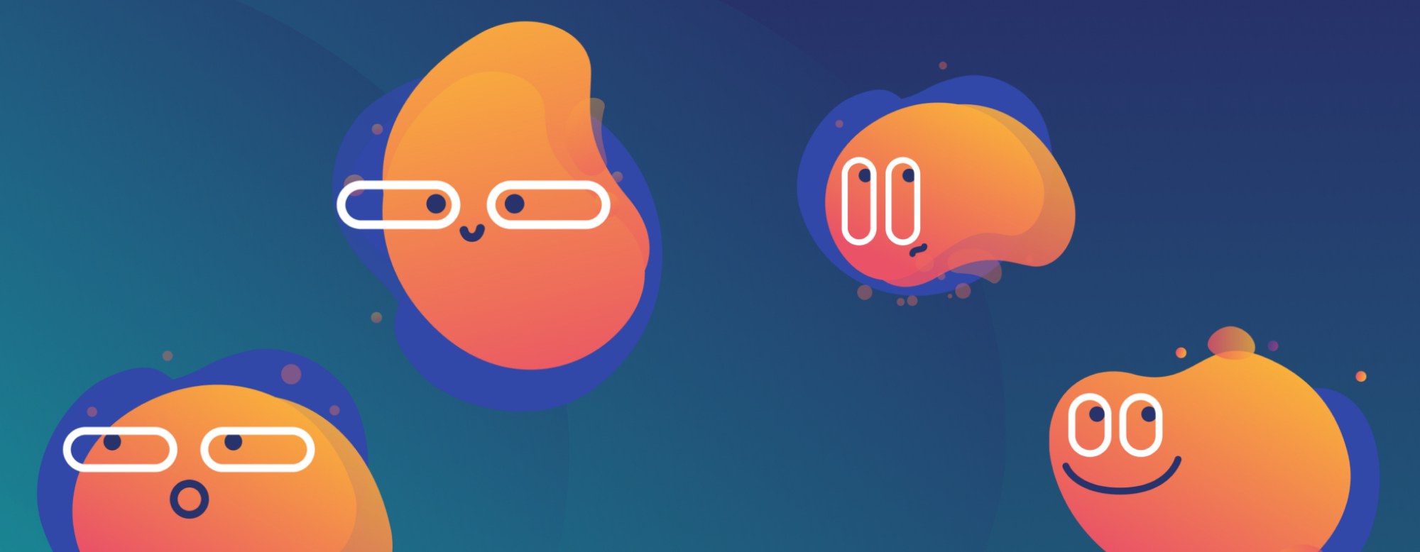
A brand built around warmth, not utility
The product was designed to feel like a "cool Jarvis": intelligent and warm, not a clinical database. That shaped the blob characters, the playful copy, and the gamification layer.
Gamification built around community, not points
Using the Octalysis Framework, we identified Epic Meaning as the dominant motivational driver. People contribute not for rewards but so others will not face the same uncertainty they did. Two flows supported this: an individual loop and a social loop with Groups and Mapathons. Badges were named to give contributors a real identity: Accessibility Whisperer, Queen of Snaps, Toilet Guru. Group features were gated behind individual activity thresholds so the community felt alive from launch.
Conclusion
SociAbility is live across the UK with 2,000+ places mapped, 40,000+ active members, and $1.69M in seed funding. The most meaningful measure is simpler: users describe it as the tool that lets them "just relax and know that you can get in without any stress."
The research tax has been reduced. The trust problem has been addressed. The community is growing.